Introduction: Beyond Aesthetics – The Power of Color in Conversions
When building a brand or designing a website, it’s tempting to view color as a purely aesthetic choice—a simple matter of what looks best. However, your color palette is one of the most potent, persuasive tools in your entire marketing arsenal. This is the foundational principle of color psychology marketing: the science of how different hues trigger specific emotions, associations, and actions in your audience. It’s a well-documented fact that a strategic approach to color psychology boosts conversions by directly influencing consumer behavior and shaping brand perception from the very first glance. The shades you choose for your logo, product packaging, and call-to-action buttons have a profound emotional influence, capable of building trust, creating urgency, and guiding users toward a sale. In this guide, we’ll show you how to leverage this power to significantly boost your conversion rate.
Introduction.1: What is Color Psychology?
At its core, color psychology is the study of how different hues affect human perception and behavior. In the context of a marketing strategy, it’s not just about aesthetics—it’s about leveraging the subconscious connections people make between specific colors and feelings like trust, urgency, or excitement. This powerful emotional influence is the engine that drives purchasing decisions. Understanding these principles allows you to intentionally shape consumer behavior, making it a foundational element in any effort to boost your conversion rate.
Introduction.2: Why Color is a Crucial, Yet Often Overlooked, Conversion Tool
Many marketing teams focus heavily on copy, SEO, and user experience, treating color as a secondary, aesthetic decision. This is a missed opportunity. Color communicates non-verbally and instantly, influencing brand perception before a user even reads your headline. This initial subconscious judgment sets the stage for everything that follows. Overlooking the strategic application of color psychology means ignoring a fundamental tool that can either build immediate trust or create dissonance, directly impacting your ability to achieve higher brand conversions.
Section 1: The Science of Color and Consumer Behavior

The link between color and action isn’t just a marketing theory; it’s rooted in how our brains are wired. Our minds process visual data like color almost instantaneously, far faster than we can read or digest complex text. This rapid processing triggers immediate, subconscious emotional responses that profoundly shape consumer behavior. Each hue carries with it a set of learned and innate associations, creating a powerful emotional influence that can either build trust or signal alarm. For marketers, this is a critical insight. By understanding how different colors are perceived, you can intentionally influence a user’s brand perception from their very first interaction. This is the fundamental mechanism through which strategic color psychology boosts conversions: it taps into the brain’s cognitive shortcuts to guide users toward desired actions, making it an essential component of any successful marketing strategy.
Section 1.1: How Our Brains Process and React to Color
Our brains are hardwired for rapid color recognition—a primal trait where hues signaled food, danger, or shelter. When you see a color, the signal bypasses rational thought and goes straight to the brain’s emotional centers. This immediate, subconscious reaction is the engine behind effective color psychology. It shapes our initial feelings and gut reactions, powerfully steering consumer behavior before a single word is even read. Understanding this neurological shortcut is key to leveraging color’s immense emotional influence in your marketing.
Section 1.2: The Link Between Colors and Specific Emotions
These neurological reactions are not random. Specific hues consistently evoke distinct emotions, forming the basis of established color meanings within color psychology. For example, blue often conveys trust and dependability, while red can trigger excitement and urgency. This predictable emotional influence allows marketers to strategically shape brand perception and steer consumer behavior. Understanding these universal associations is fundamental, as this is precisely how a well-chosen palette ultimately helps to boost your conversion rate.
Section 1.3: Considering Cultural and Demographic Nuances in Color Perception
While general color meanings provide a strong foundation, it’s a critical mistake to assume they are universal. Effective color psychology requires acknowledging that perception is also shaped by cultural, demographic, and even personal experiences. For example, while white signifies purity in many Western cultures, it represents mourning in parts of Asia. A successful marketing strategy must research its target audience to avoid such missteps, ensuring your palette doesn’t inadvertently create a negative emotional influence and harm your brand conversions.
Section 2: The Meaning of Colors in Marketing: A Detailed Palette

With the foundational science established, we can now move into the practical application: exploring the specific color meanings used in marketing. This section serves as your strategic palette, detailing how individual hues can be leveraged to shape brand perception and guide consumer behavior. While cultural context is vital, certain colors carry widely understood associations that form the bedrock of a successful marketing strategy. We will dissect the unique emotional influence of key colors—from the trust-building power of blue to the urgent call of red and the organic calm of green. Understanding how to deploy each color is the critical step where the theory of color psychology boosts conversions in the real world. By mastering this palette, you gain the ability to intentionally communicate your brand’s core message and effectively boost your conversion rate before a customer reads a single word.
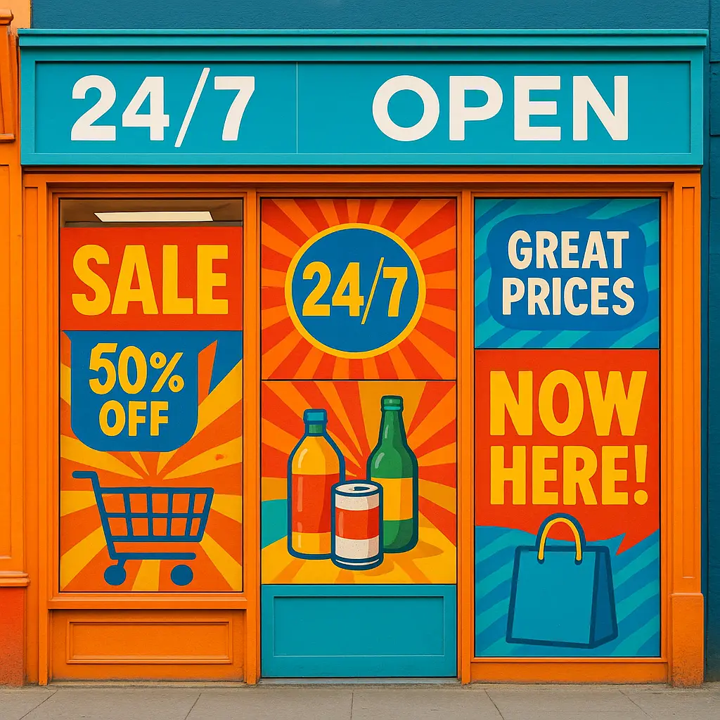
Section 2.1: Red: Urgency, Passion, and Excitement
Red is a powerhouse in color psychology marketing, commanding attention with an emotional influence that evokes passion, excitement, and, most importantly, urgency. It’s the go-to color for clearance sales, limited-time offers, and critical call-to-action buttons like “Buy Now.” This is because red triggers a visceral response, stimulating consumer behavior by creating a sense of scarcity or a can’t-miss opportunity. Used strategically, it’s a proven method to boost your conversion rate, but must be applied carefully to avoid signaling alarm or aggression.
Section 2.2: Blue: Trust, Security, and Dependability
In the world of color psychology, blue is the undisputed champion of trust and security. It has a calming emotional influence, conveying dependability and professionalism. This is why it’s heavily favored by financial institutions, tech companies, and healthcare providers. Using blue in your marketing strategy helps build a brand perception of reliability, making customers feel safe. This sense of security is crucial for influencing consumer behavior, as it lowers purchase anxiety and ultimately leads to higher brand conversions.
Section 2.3: Green: Growth, Health, and Nature
Green is intrinsically linked to nature, health, and prosperity in color psychology. This makes it the ideal choice for brands in the wellness, environmental, and financial sectors. Its emotional influence is restorative and calming, creating a positive brand perception of growth and well-being. This association powerfully influences consumer behavior, encouraging purchases that feel responsible and healthy. Using green strategically can reassure customers and is a proven way to boost your conversion rate, especially for eco-conscious or health-focused audiences.
Section 2.4: Yellow & Orange: Optimism, Warmth, and Action
Yellow and orange are the colors of optimism and energy in color psychology. They radiate warmth and cheerfulness, creating an inviting emotional influence that can make a brand feel friendly and approachable. Orange, in particular, is a fantastic color for calls-to-action; it combines red’s urgency with yellow’s positivity, encouraging consumer behavior without feeling aggressive. Using these hues for buttons like “Add to Cart” or “Subscribe” can make the action feel more appealing and is a simple tactic to help boost your conversion rate.
Section 2.5: Black & White: Luxury, Sophistication, and Simplicity
In color psychology, black and white are masters of sophistication and clarity. Black is synonymous with luxury, power, and exclusivity, shaping a premium brand perception that drives high-value sales. Conversely, white evokes minimalism and simplicity, creating an emotional influence of cleanliness and ease. Used together, they create a timeless, high-contrast look that effectively guides consumer behavior by communicating quality and elegance, making this palette a powerful way to boost your conversion rate for premium goods.
Section 2.6: Purple: Creativity, Wisdom, and Royalty
In color psychology, purple has long been associated with royalty, wisdom, and creativity, making it a powerful choice for brands wanting to convey sophistication and imagination. Its unique emotional influence suggests both luxury and innovative thinking, shaping a brand perception of high quality and originality. This makes it highly effective for beauty brands, high-end products, or services focused on creativity. Using purple strategically attracts a discerning audience and positively influences consumer behavior, making it a valuable tool to boost your conversion rate.
Section 3: How to Build a Conversion-Focused Color Strategy
Understanding individual color meanings is the first step, but the real power is unlocked when you assemble them into a cohesive plan. Building a conversion-focused color palette isn’t about picking your favorites; it’s a deliberate marketing strategy designed to align your brand’s personality with your audience’s psychological triggers. The goal is to create a consistent visual language that guides consumer behavior from the first impression to the final click. This process involves defining your brand’s core message, understanding your target demographic’s expectations, and using color hierarchies to draw attention where it matters most. A well-researched approach ensures that your brand perception is both intentional and effective. This is how strategic color psychology boosts conversions, turning aesthetic choices into a predictable engine for growth and helping you consistently boost your conversion rate.
Section 3.1: Step 1: Define Your Brand’s Personality and Values
Before choosing a single color, you must first define your brand’s personality. Are you playful and innovative, or secure and traditional? Your answer is the cornerstone of your marketing strategy. The goal is to select colors whose inherent emotional influence aligns with your core values. This ensures you build an authentic brand perception that resonates with your target audience, guiding consumer behavior from the very first glance and setting the foundation to boost your conversion rate.
Section 3.2: Step 2: Understand Your Target Audience’s Psychology
With your brand identity defined, your marketing strategy must now focus on the audience. Effective color psychology depends on understanding their demographic and cultural expectations. A color that excites a young audience may not resonate with an older one. Researching these preferences is crucial for tailoring your emotional influence to guide consumer behavior effectively. This alignment ensures your brand perception connects with your target market, a key step to boost your conversion rate.
Section 3.3: Step 3: Implement the 60-30-10 Rule for a Balanced Design
Once your core colors are chosen, the 60-30-10 rule is a simple yet powerful marketing strategy for applying them. This interior design principle dictates that 60% of your space should be a dominant color, 30% a secondary color, and 10% an accent color. In web design, this creates visual balance and hierarchy. Your 10% accent color should be the most vibrant hue, reserved for calls-to-action to guide consumer behavior and boost your conversion rate.
Section 3.4: Step 4: Analyze Your Competitors’ Color Choices
Your marketing strategy doesn’t exist in a vacuum. Analyze what colors your direct competitors are using to understand the established visual norms of your industry. This gives you a critical choice: align with industry standards to tap into existing customer expectations, or intentionally differentiate with a unique palette to stand out. Both paths can be valid, but the decision directly influences your brand perception and is a key factor in how your approach to color psychology boosts conversions.
Section 4: Practical Application: Where to Use Color for Maximum Impact

With your strategic palette defined, the crucial next phase is targeted implementation. Applying your colors with precision across key brand touchpoints is where the theory of color psychology boosts conversions in the most tangible ways. This isn’t about splashing your dominant color everywhere; it’s a focused marketing strategy that uses specific hues to guide consumer behavior at pivotal moments in the customer journey. Key areas for maximum impact include your logo, which establishes initial brand perception, your website’s hero banners, and, most critically, your call-to-action (CTA) buttons. The color of a “Buy Now” or “Sign Up” button can have a dramatic emotional influence and is a primary driver of action. By deploying your colors thoughtfully in these high-leverage spots, you create a powerful visual path that works directly to boost your conversion rate and achieve higher brand conversions.
Section 4.1: Website Heroes and Backgrounds
Your website’s hero section and background are your digital first impression. This space is ideal for deploying your dominant brand color (the 60% from the 60-30-10 rule) to establish an immediate emotional influence. A calm blue can instantly build trust, while a clean white background communicates simplicity. This initial color wash sets the entire mood, shapes brand perception, and guides consumer behavior by making your core message and call-to-action stand out, creating a cohesive experience designed to boost your conversion rate.
Section 4.2: Logos and Branding Elements
Your logo and branding elements are the face of your company. This is where your chosen colors work hardest to establish an immediate brand perception. The hue of your logo is a powerful, condensed message that leverages color psychology to communicate your core values in an instant—think of the dependability of IBM’s blue or the passion of Target’s red. This choice creates a lasting emotional influence that builds recognition and trust, directly impacting consumer behavior and ultimately supporting higher brand conversions.
Section 4.3: High-Contrast Call-to-Action (CTA) Buttons
Your call-to-action buttons are arguably the most crucial application of color psychology for driving immediate action. To guide consumer behavior and get the click, your CTA must be impossible to miss. This is achieved through high contrast. The button color—often your 10% accent hue from the 60-30-10 rule—should starkly stand out from the page’s background. A bright orange or green button on a blue or white page creates a powerful visual pull, leveraging an emotional influence that screams “click me.” This single choice is how color psychology boosts conversions most directly.
Section 4.4: Forms, Pop-ups, and Banners
These elements are designed to capture attention and drive a specific action. The strategic use of color psychology is what makes them effective. Your accent color should be used on headlines or submit buttons to guide consumer behavior and make the desired action clear. The background color of a pop-up can also create a powerful emotional influence—a subtle, dark overlay can add a sense of premium exclusivity. These choices ensure your message cuts through the noise and helps to boost your conversion rate on sign-ups and lead-generation efforts.
Section 5: Don’t Guess, Test: A/B Testing Colors for Optimal Results

While the principles of color psychology provide a powerful starting point for your marketing strategy, they are not a substitute for real-world data. Your audience is unique, and their reactions can’t be fully predicted by theory alone. This is where A/B testing becomes your most critical tool. By systematically testing different color variations—such as a red versus a green “Buy Now” button—you move beyond assumptions and gather concrete evidence on what actually drives consumer behavior. This data-driven approach is the only way to definitively prove how your choices impact brand perception and performance. It transforms your educated guess into a validated tactic, providing clear proof that your specific application of color psychology boosts conversions. Ultimately, testing removes the guesswork and allows you to fine-tune your palette to achieve the highest possible boost in your conversion rate.
Section 5.1: Why Data Trumps Opinion in Color Selection
Internal debates over color are common but often based on subjective opinion rather than performance. What you or your CEO find appealing has no bearing on its true emotional influence on your customers. A/B testing replaces guesswork with concrete data, showing you precisely how different hues impact real-world consumer behavior. This evidence-based approach is crucial, as it provides undeniable proof of what works, allowing you to optimize your strategy and truly boost your conversion rate based on results, not feelings.
Section 5.2: Simple Tools and Methods for A/B Testing Your Color Palette
Getting started with A/B testing is easier than you think. Many marketing platforms like HubSpot, Unbounce, or dedicated tools like Optimizely have built-in features for this. The method is simple: create two versions of a page, changing only one color element, such as a CTA button. Then, direct traffic evenly between them. By measuring which version leads to more clicks, you gain direct insight into how color affects consumer behavior. This is a core part of a data-driven marketing strategy to definitively boost your conversion rate.
Section 5.3: Case Study: How a CTA Color Change Drove a 20% Uplift
A classic case study perfectly illustrates this principle. Performable (later acquired by HubSpot) tested a green call-to-action button against a red one. Despite theories that green means “go,” the red button generated a 21% increase in clicks. This test is a textbook example of how a color’s emotional influence directly impacts consumer behavior. By relying on data instead of assumptions, they found the optimal hue to significantly boost their conversion rate, validating their marketing strategy with hard numbers.
Conclusion: Paint Your Path to Higher Conversions
We’ve journeyed beyond mere aesthetics to uncover the powerful science of how color psychology boosts conversions. The key takeaway is this: your color palette is not a decorative afterthought, but a foundational pillar of your marketing strategy. From understanding the core emotional influence of individual hues to building a cohesive brand identity and analyzing your audience, every step is a deliberate move to shape brand perception. You now have the blueprint to apply color with precision—on your logo, website, and high-contrast CTA buttons—to actively guide consumer behavior. But remember, the final, crucial step is to test. By replacing assumptions with data, you can definitively prove what resonates with your audience. Armed with this knowledge, you can now intentionally paint a path for your customers, turning your brand’s visual identity into a predictable and powerful engine to boost your conversion rate and drive sustainable growth.
Conclusion.1: Key Takeaways: A Summary of Actionable Insights
To summarize, your marketing strategy should begin by aligning colors with your brand’s personality. Apply these hues with purpose, using high-contrast colors for calls-to-action to guide consumer behavior. While general color meanings are a great starting point, never skip A/B testing. Data is the only way to truly understand the emotional influence that works for your audience and prove how your chosen palette helps to boost your conversion rate.
Conclusion.2: Final Thought: Using Color Intentionally and Authentically
Ultimately, the power of color psychology lies in its authentic application. It isn’t about tricking users, but about communicating your brand’s true identity more effectively. When your colors genuinely reflect your values, you build a consistent and trustworthy brand perception. This authenticity creates a powerful emotional influence that resonates with customers, encouraging genuine connection rather than just a click. This intentional approach is what sustainably guides consumer behavior and builds lasting brand conversions.