Introduction: Why a Great Business Card Still Matters
In an age of digital profiles and instant online connections, it’s easy to wonder if the traditional business card has lost its relevance. The answer is a resounding no. A well-crafted, professional business card remains one of the most powerful direct marketing tools available. It’s a tangible piece of your brand that a potential client can hold, a physical reminder of your interaction that a LinkedIn request simply can’t replicate. It shows preparedness and solidifies a first impression. But knowing what to put on a business card and how to arrange it effectively is key. Understanding the complete business card anatomy, from a compelling business card design to a flawless print finish, is crucial. This guide provides the essential business card tips you need, breaking down exactly how to make a business card that not only informs but also impresses, ensuring you stand out in a crowded marketplace.
Section 1: The Core Anatomy of a Business Card (What to Include)

Before diving into flashy designs or unique materials, mastering the fundamentals is the first critical step. The core business card anatomy of a professional business card is all about clarity and function. Answering the question of what to put on a business card starts with these non-negotiable elements. Your company logo and name should be prominent to build brand recognition instantly. Your full name and job title must be clearly legible, establishing your role and credibility. Crucially, provide direct contact information: a primary phone number, a professional email address, and your company’s website. These components form the essential framework of any effective business card layout. Neglecting any of these basics can render even the most beautiful card useless, as they provide the essential information a potential client needs to connect with you. Getting this foundation right is the most important part of how to make a business card that truly works for you.
Section 1.1: Your Name and Job Title
This is arguably the most personal component of your business card anatomy. Your full name should be presented clearly and prominently, making it one of the first things a person sees. It’s your personal identifier and establishes a direct, human connection. Equally important is your job title. This small line of text provides immediate context, clarifying your role within the company and establishing your authority or specialty. When deciding on this crucial detail of what to put on a business card, aim for clarity over cleverness. While a unique title can be memorable, a title like “Marketing Director” is often more useful and descriptive than “Brand Evangelist.” A vague title can cause confusion, undermining the card’s purpose. Together, your name and title form a powerful duo that introduces who you are and what you do, a foundational element for any professional business card and a key step in learning how to make a business card that communicates with precision and confidence.
Section 1.2: Company Name & Logo
Just as your name and title establish your personal identity, your company name and logo are the visual cornerstones of your brand’s identity. The logo is the most powerful element for immediate recognition and is the anchor of your entire business card design. A well-designed logo creates a lasting visual impression that helps clients recall your business long after your meeting. For a truly professional business card, it is absolutely critical that your logo is a high-resolution file; a pixelated or blurry logo instantly undermines your credibility. Place it prominently within your business card layout, making it a focal point without overwhelming other essential information. Your full company name must be equally clear and legible, creating an inseparable link between the visual symbol and your business. Getting this visual hierarchy correct is a fundamental step in learning how to make a business card that communicates brand authority and professionalism at a single glance, turning a simple card into a potent marketing asset.
Section 1.3: Essential Contact Information (Phone, Email, Website)
Once a potential client knows who you are and what you do, the next logical step is giving them the means to act. This is where your contact information becomes the most critical component of what to put on a business card. The ultimate goal of learning how to make a business card is to generate connections, and that can’t happen without clear pathways. At a minimum, include a primary phone number—a direct line is ideal for accessibility—and a professional email address. One of the most vital business card tips is to use a domain-specific email (e.g., name@yourwebsite.com), as it conveys far more credibility than a generic free address. Finally, your website URL serves as your digital storefront. It’s a low-pressure invitation for contacts to explore your services, view your portfolio, or learn more about your brand story. These three elements form the functional engine of any professional business card; getting them right is the key to converting a first impression into a tangible opportunity.
Section 1.4: Social Media Handles (Optional but Recommended)
In today’s connected world, a website is often just the beginning of your digital footprint. Including social media handles is no longer just for a creative business card; it’s a strategic move for almost any professional. When considering what to put on a business card, think about which platforms best showcase your brand. A visual artist or designer should absolutely feature their Instagram or Behance profile. A B2B consultant or corporate leader would benefit most from highlighting their LinkedIn. The goal isn’t to list every profile you own, but to guide potential clients to where they can see your work, understand your company culture, and engage with you most effectively. One of the most important business card tips is to use clean, simple icons for each platform next to your handle. This saves space, enhances the visual appeal of your business card layout, and makes your card a more powerful gateway to your complete brand story. It’s a modern element that demonstrates you are active and accessible.
Section 1.5: Tagline or Value Proposition
Beyond your job title, a tagline or value proposition quickly communicates the unique benefit you offer. This short, powerful phrase is a critical component to consider for your business card layout because it answers the unspoken question in a potential client’s mind: “What’s in it for me?” This element of the business card anatomy instantly differentiates you from competitors. Instead of a generic description, a strong tagline clarifies your purpose and value. For example, “Financial Planning” is good, but “Building Your Secure Financial Future” is better because it focuses on the client’s benefit. When thinking about what to put on a business card, this detail can transform a simple contact card into a compelling marketing piece. Adding a concise, memorable tagline is an expert step in learning how to make a business card that doesn’t just state what you do, but also why it matters to your future clients.
Section 2: Key Design Principles for an Unforgettable Card
With all the essential information gathered, the next critical phase in learning how to make a business card is the art of arrangement: the business card design. A great design is more than just aesthetic appeal; it is a masterclass in strategic communication. The principles of a strong business card layout are rooted in guiding the viewer’s eye to the most important information first. This involves creating a clear visual hierarchy, using whitespace (or negative space) effectively to prevent a cluttered feel, and choosing typography and colors that both reflect your brand’s personality and ensure maximum readability. A truly professional business card balances creativity with clarity, making it easy for a potential client to absorb your details at a glance. Whether you’re aiming for a classic, minimalist look or a bold, creative business card, these foundational design rules are what elevate your card from a simple handout to a memorable and effective marketing tool.
Section 2.1: Establishing a Clear Visual Hierarchy
Visual hierarchy is the secret ingredient in a successful business card layout. It’s the art of arranging elements to guide the viewer’s eye in a specific order of importance. Think of it as a roadmap for information. The most important elements—typically your logo and your name—should be the most prominent. You can achieve this through size, boldness, or strategic placement. Your job title and company name usually follow in importance, providing essential context. Finally, your contact details, while critically important for function, can be smaller and grouped together. They don’t need to scream for attention, just be perfectly clear and legible. A well-executed hierarchy ensures your card is scanned and understood in seconds, not deciphered. This is a non-negotiable principle in any effective business card design and a cornerstone of learning how to make a business card that feels both professional and effortless to read.
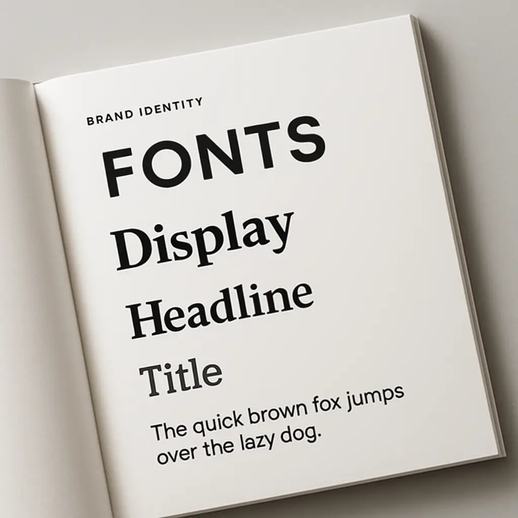
Section 2.2: Choosing the Right Typography (Fonts and Sizing)
The fonts you choose for your card speak volumes about your brand before a single word is read. Typography is a cornerstone of effective business card design, directly impacting both personality and legibility. For a traditional, trustworthy feel, a serif font (with small decorative strokes) is a great choice. For a clean, modern aesthetic, a sans-serif font is ideal. One of the most important business card tips is to limit yourself to two, or at most three, complementary fonts to avoid a cluttered look. Use one for your name and company name, and a different, highly-readable one for your contact details. Sizing is just as crucial for a professional business card. While your name can be larger to create hierarchy, ensure your contact information is no smaller than 7pt or 8pt to guarantee readability. This careful attention to typography is a vital step in learning how to make a business card that is as functional as it is beautiful.
Section 2.3: Using Color Theory to Your Advantage
Color is one of the most immediate and impactful elements of your business card design. It’s a psychological shortcut that can instantly communicate your brand’s personality. The first rule is consistency: your color palette should align with your existing brand identity, including your logo and website, to create a cohesive and recognizable experience. When learning how to make a business card, consider what emotions you want to evoke. Blues and greys convey trust and stability, making them ideal for a professional business card in corporate or tech fields. Warmer colors like red or orange can communicate energy and passion, perfect for a creative business card. One of the most crucial business card tips is to ensure high contrast for readability—dark text on a light background is almost always a safe bet. Using color strategically doesn’t just make your card look good; it reinforces your message and makes your brand more memorable long after the handshake.
Section 2.4: The Importance of White Space
In effective business card design, what you don’t include is often as important as what you do. White space, also called negative space, is the empty area around the elements in your business card layout. Its purpose is to reduce clutter and create focus. A card packed from edge to edge with text and graphics feels overwhelming and can look unprofessional. By strategically leaving areas blank, you give your content room to breathe, which dramatically improves readability and comprehension. This is a critical discipline when learning how to make a business card that feels elegant and confident. One of the most valuable business card tips is to resist the urge to fill every corner. Ample white space not only makes your card easier to scan but also conveys a sense of sophistication and calm authority, allowing your logo and key contact information to stand out with greater impact.
Section 2.5: Creative Layouts and Orientation (Horizontal vs. Vertical)
The orientation of your card is a fundamental decision in your business card layout that dramatically influences its first impression. The traditional horizontal layout is the standard for a reason: it’s familiar, fits easily into wallets and cardholders, and is often the easiest to design for. It’s a safe and effective choice for any professional business card. However, choosing a vertical orientation can be a powerful move. It immediately stands out from the pile, signaling a modern, unconventional, or creative business card. This format works especially well for brands in design, tech, or art, as it breaks the norm and forces a second look. When considering how to make a business card, think about which orientation best complements your logo and information flow. A tall, narrow logo might naturally suit a vertical card. The choice isn’t just aesthetic; it’s a strategic part of your overall business card design that should align with the brand image you want to project.
Section 3: Making Your Card Stand Out (Creative Elements)

Once you’ve mastered the essential information and solid design principles, the next stage in learning how to make a business card is to infuse it with a memorable “wow” factor. This is where you move beyond the visual and engage the sense of touch. The physical properties of your card—its weight, texture, and shape—are powerful tools that can transform a good card into a creative business card that people remember. Opting for a thicker paper stock, a unique finish like embossing or foil stamping, or even a custom die-cut shape are strategic choices that reflect the quality and personality of your brand. These tangible details are among the most impactful business card tips for making a lasting impression. They aren’t just add-ons; they are integral parts of the business card design process that communicate premium value and attention to detail before a client even reads your contact information, setting your professional business card apart from the competition.
Section 3.1: Choosing a Unique Paper Stock and Finish (Matte, Glossy, Textured)
The physical feel of your card communicates value before a single word is read. The paper stock—its thickness and weight—is the foundation of this tactile experience. A flimsy card feels cheap, but a thick, heavy card stock (16pt or higher) feels substantial and premium, immediately elevating your brand. This is one of the most effective business card tips for making a card that feels important. The finish you choose then defines its personality. A Matte finish is smooth and non-reflective, creating a modern, sophisticated look perfect for an elegant professional business card. A Glossy finish is shiny and makes colors pop, ideal for a vibrant, photo-heavy, or creative business card. For a truly unique impression, consider a Textured stock like linen or felt. This is an advanced step in learning how to make a business card because it engages the sense of touch, making your card physically memorable. Your choice of stock and finish is a crucial business card printing decision that reinforces your brand identity.
Section 3.2: Incorporating Special Finishes (Foil, Embossing, Spot UV)
To truly elevate your business card design from standard to stunning, consider using special finishes. These techniques add a tactile and visual layer that makes your card impossible to ignore. Foil Stamping applies a thin, metallic layer to specific areas, creating a luxurious, reflective effect perfect for your logo or name. For a different kind of physical dimension, Embossing (raising elements) or Debossing (indenting them) adds a sophisticated, three-dimensional texture that begs to be touched. Another popular choice is Spot UV, where a high-gloss varnish is applied to select parts of the card—like your logo—while the rest remains matte. This creates a striking contrast that catches the light and draws the eye. These advanced business card printing options are among the most effective methods for crafting a creative business card. Understanding them is a key step in learning how to make a business card that feels as premium and detail-oriented as your brand itself.
Section 3.3: Die-Cuts and Unique Shapes
For the ultimate statement piece, breaking free from the standard rectangle is one of the most effective ways to craft a memorable creative business card. This is achieved through a business card printing process called die-cutting, which uses a custom-shaped blade to cut your card into a unique form. The creative potential is immense. A subtle die-cut could mean simply rounding the corners for a softer, more modern feel. A bolder approach involves creating a shape that reflects your brand identity—a coffee cup for a café, a house for a real estate agent, or a comb for a hairstylist. This technique shows a deep commitment to your brand and is a guaranteed way to stand out. When exploring how to make a business card with a custom shape, ensure the design remains practical. It should still be durable and easy to store in a wallet. A unique shape instantly makes your business card design an interactive experience, ensuring it gets a second look and is remembered long after it’s handed over.
Section 3.4: Using the Back of the Card Effectively (QR Codes, Testimonials)
One of the most common missed opportunities in business card design is leaving the back of the card completely blank. This valuable real estate is the perfect place to add function and personality without cluttering your primary contact information. A powerful modern approach is to include a QR code. This simple graphic provides a seamless bridge from your physical card to your digital world, instantly linking a potential client to your website, portfolio, or a specific landing page. It’s a key step in learning how to make a business card for the modern era. Another highly effective strategy is to feature a short, impactful client testimonial or your company tagline. This adds a layer of social proof and reinforces your value proposition. Using the back thoughtfully is one of the best business card tips; it transforms your card from a static object into an interactive tool that drives action and deepens the connection with your brand.
Section 4: Technical Print-Ready Tips

After finalizing your design, the final stage of learning how to make a business card is preparing the file for a professional printer. This technical step is absolutely crucial; a brilliant concept can be undermined by a poorly prepared file, resulting in a disappointing final product. For successful business card printing, you must pay attention to three critical elements: bleed, safe area, and color mode. The bleed is an extra margin of your design that extends beyond the final trim line, ensuring no unprinted white edges appear after cutting. The safe area is the inner margin where all essential text and logos must stay to avoid being accidentally trimmed off. Finally, it is imperative to design in the CMYK (Cyan, Magenta, Yellow, Black) color profile, not RGB. Screens use RGB, but printers use CMYK, and this ensures your brand colors print accurately. Adhering to these technical rules, along with using a high resolution of 300 DPI, is the final quality check that guarantees your professional business card looks as sharp and polished in hand as it did on your screen.
Section 4.1: Understanding Bleed, Trim, and Safe Zones
Mastering the concepts of bleed, trim, and safe zones is what separates an amateur file from a print-ready one, and it’s a critical technical step in learning how to make a business card. Imagine three nested rectangles. The outermost line is the Bleed. This is an extra border of your background color or image (typically 1/8 inch or 3mm) that extends beyond the final size of the card. Its purpose is to prevent unprinted white edges if the cutting machine is slightly misaligned. The middle line is the Trim Line, which is the actual edge where your card will be cut to its final dimension. Finally, the innermost line marks the Safe Zone. All your essential text and logo elements must stay inside this area to ensure they aren’t accidentally cut off. Adhering to these guides is one of the most important aspects of professional business card printing, guaranteeing your final product has clean edges and a perfectly centered, professional appearance.
Section 4.2: Designing in CMYK vs. RGB
One of the most common yet critical technical errors in business card design is working in the wrong color mode. Digital screens, like your monitor or phone, create color using an RGB (Red, Green, Blue) light-based model, which results in bright, vibrant hues. Professional printers, however, operate on a CMYK (Cyan, Magenta, Yellow, Black) ink-based model. If you design your card in RGB, the colors will be converted to CMYK during the business card printing process, which can lead to a disappointing and unexpected color shift. That brilliant electric blue on your screen may print as a duller, muted navy. To avoid this and ensure your brand colors are accurate, it is absolutely essential to set up your design file in the CMYK color mode from the very start. This is a fundamental step in learning how to make a business card that looks just as professional in hand as it does on your computer, guaranteeing brand consistency.
Section 4.3: Using High-Resolution Images and Logos (300 DPI)
The final ingredient for a technically perfect file is ensuring every visual element has a high resolution. Print quality is measured in DPI, or Dots Per Inch, which dictates the sharpness and detail of your printed images. For professional business card printing, the non-negotiable industry standard is 300 DPI. A common and costly mistake is pulling a logo or photo from a website; these images are typically optimized for screens at a low resolution of 72 DPI. Using them for print will result in a final product that looks blurry, pixelated, and unprofessional. A fuzzy logo instantly undermines your brand’s credibility and suggests a lack of attention to detail. Therefore, a critical step in learning how to make a business card that looks polished is to always use high-resolution source files. For logos, a vector file (.AI, .EPS, .SVG) is ideal as it can be scaled to any size without losing quality, guaranteeing a crisp and impressive result for your professional business card.
Section 4.4: Choosing the Right File Format (PDF, AI, EPS)
Submitting your final design in the correct format is the last crucial handoff in the business card printing process. While printers may accept several file types, some are far safer than others. The gold standard and most universally accepted format is a high-resolution PDF (Portable Document Format). A properly saved PDF embeds all your fonts, images, and vector graphics into a single, self-contained file. This ensures that what you see on your screen is exactly what the printer will see, eliminating issues with missing fonts or broken image links. Other professional formats include native source files like AI (Adobe Illustrator) or EPS (Encapsulated PostScript). These are excellent because they are vector-based and easily editable by a designer, but they can sometimes cause problems if fonts aren’t outlined or images aren’t embedded. For this reason, most printers prefer a print-ready PDF. Mastering this final technical step is essential when learning how to make a business card that moves from concept to reality without any hitches. Always check your printer’s specific guidelines, but preparing a high-quality PDF is your surest bet for a flawless professional business card.
Conclusion: Final Checklist Before You Print
You’ve journeyed through the entire process, from deciding on the essential information to exploring creative finishes and mastering the technical file setup. Before you send your masterpiece for business card printing, a final review is the last critical step in learning how to make a business card that delivers results. Run through this quick mental checklist: First, proofread every word. Are your name, title, and contact details 100% accurate? Next, review your business card design. Does it have a clear visual hierarchy, legible fonts, and on-brand colors? Finally, confirm the technicals. Is the file 300 DPI, in CMYK color mode, and does it include proper bleed and safe zones? Taking these last few moments to double-check your work ensures your investment results in a flawless, professional business card you can be proud of. It’s no longer just a card; it’s a powerful, tangible representation of your brand’s quality and attention to detail.