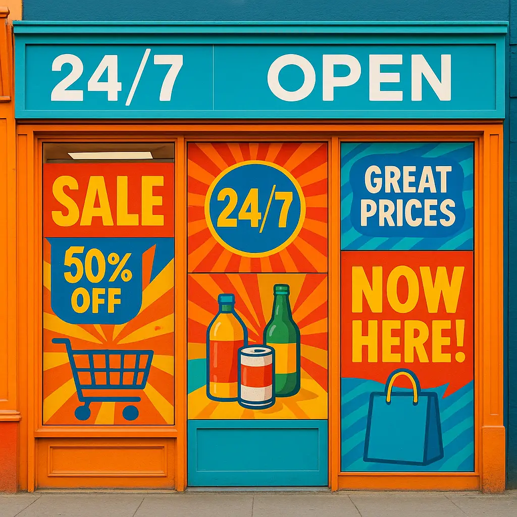
Window Graphics: Turn Your Storefront into a 24/7 Billboard
Transform your storefront into a 24/7 billboard! Discover how store window graphics, from decals to lettering, boost visibility, attract customers, and enhance your brand.

Picture the scene: a user is on their phone, their thumb in a state of perpetual motion, flying past an endless stream of updates, photos, and ads. In this river of digital noise, how does your message break through? This is the central challenge for brands and creators today. Simply posting content isn’t enough; you need to consciously interrupt that mindless scroll. This is where the magic of thumb-stopping graphics comes into play. More than just pretty pictures, this is engaging visual content engineered to seize attention in less than a second. Powerful social media design is the critical difference between being seen and being completely ignored. In this guide, we’ll explore the essential strategies and tips you need to create social media graphics that not only stop the scroll but also drive meaningful engagement and build a memorable brand presence.

Before you even open a design tool, the most effective scroll-stopping content is built on a solid strategic foundation. Great graphic design for social media isn’t about random trends; it’s about clarity and purpose. This foundation rests on three core pillars: your audience, your platform, and your brand. First, who are you trying to reach? Understanding their preferences is essential. Second, where will the graphic live? A design for a LinkedIn article will have different requirements than an Instagram Story. Finally, every visual must reinforce your identity. This is where brand consistency is key—using established colors, fonts, and logos builds recognition and trust. Nailing these fundamentals is the most critical first step when you set out to create social media graphics that make a genuine impact in a crowded feed and strengthen your visual branding.
A core principle of effective social media design is that one size never fits all. The vibrant, aesthetic-heavy visuals that excel on Instagram would likely feel out of place on the professional, information-driven feed of LinkedIn. Similarly, Facebook graphics often benefit from a more community-focused or direct-response feel. To successfully create social media graphics that capture attention, you must adapt your dimensions, style, and messaging for each platform’s unique context. This tailored approach ensures your content feels native and genuinely engaging.
Going beyond platform rules, the most engaging visual content speaks directly to the audience’s preferences. To effectively create social media graphics, you must understand your demographic’s visual language. Are they drawn to minimalist aesthetics, bold and bright colors, or organic, earthy textures? Do they engage with humorous memes, data-driven infographics, or aspirational user-generated content? Analyzing past performance and competitor successes will reveal what visual style will resonate most deeply and compel them to pause and pay attention.
Your color palette and font suite are the bedrock of your visual branding. Establishing and consistently using a defined set of colors and typography is what makes your content instantly recognizable in a crowded feed. This unwavering brand consistency is non-negotiable for building recall. When followers see your signature style, they immediately connect the post to your brand, which builds trust and authority. This also simplifies your workflow, making it faster and easier to create social media graphics that always look professional and on-brand.
While essential for brand consistency, your logo shouldn’t be the main event. Strategic placement ensures your mark is visible for recognition without distracting from the core message. When you create social media graphics, place your logo or brand mark consistently—often in a corner—where it won’t be cropped by platform interfaces. This subtle but repetitive positioning trains your audience to associate the content with you instantly. Effective visual branding is about balance; your logo should be a quiet signature, not a loud interruption.
Beyond brand consistency, color is your most powerful tool for creating an immediate emotional response. High-contrast combinations and bold, vibrant hues are essential for making your designs pop against the standard interfaces of most platforms. When you create social media graphics, consider the psychology: use energetic reds for urgency or calming blues for trust. This intentional use of color is a critical social media graphics tip for crafting visuals that don’t just look good, but feel compelling enough to stop the scroll.
Beyond choosing bold colors, the contrast between them is what truly creates visual impact. A core principle of effective social media design is ensuring immediate readability. High contrast—placing light text on a dark background or vice versa—is non-negotiable for this, especially on small mobile screens where low-contrast elements are easily skipped. This is one of the most vital social media graphics tips to make your message pop. When you create social media graphics, always prioritize high contrast to ensure your work is both accessible and compelling.

With a solid strategy built on audience, platform, and brand consistency, it’s time to apply that knowledge to the canvas. This is where we move from theory to the hands-on, practical methods that truly craft thumb-stopping graphics. The following actionable techniques are the building blocks of superior social media design, focusing on composition, imagery, and typography to create an immediate visual hierarchy that guides the viewer’s eye. Think of these as your core toolkit for execution. Learning how to effectively implement these principles is what separates generic visuals from professionally crafted, engaging visual content. When you set out to create social media graphics, mastering these techniques will ensure your message is not only seen but also felt, compelling users to pause, read, and engage with your brand in a meaningful way.
The imagery you choose sets the entire tone for your post. While quality stock photos are accessible, savvy audiences can often spot them, which can make your brand feel generic. To craft truly engaging visual content, investing in custom or professional photography is a powerful move. This ensures your visuals are unique, authentic, and perfectly aligned with your brand story. When you create social media graphics, original photos offer a level of trust and distinction that overused stock images simply cannot match.
Not every concept can be captured with a photo. This is where illustrations and icons become essential tools in your social media design toolkit. They excel at simplifying complex ideas, visualizing abstract data, or adding a unique brand personality that photography can’t. Think of icons as a universal visual language that makes instructions or benefits instantly clear. When you create social media graphics, using a consistent suite of branded icons and illustrations can make your content more scannable, memorable, and ultimately more effective.
Your typography is the voice of your brand. The fonts you choose must be instantly legible on small screens, otherwise your message will be lost in the scroll. A crucial part of effective social media design is selecting a font suite that reflects your brand personality while prioritizing clarity. When you create social media graphics, stick to two or three complementary, on-brand fonts. Using an overly complex or decorative font for key information is a common mistake that hurts readability and stops engagement before it can start.
In a fast-moving feed, no one reads a paragraph on an image. Your text must be a short, powerful hook designed to be absorbed in a split second. Aim for 3-7 words that create curiosity, state a bold benefit, or ask a direct question. When you create social media graphics, treating your headline like a micro-advertisement is crucial. This punchy copy works with your visuals to stop the scroll, making your message instantly understandable and turning a simple post into genuinely engaging visual content.
Effective social media design is about controlling where the user looks first. Composition and scale are your primary tools for this. Make your most important element—whether it’s a shocking statistic, a key benefit, or a compelling image—significantly larger than anything else on the canvas. This creates an undeniable focal point and visual hierarchy. When you create social media graphics, using scale intentionally ensures your message is understood instantly, turning a chaotic design into powerful, engaging visual content that stops the scroll.
In effective social media design, what you don’t include is as important as what you do. White space, or negative space, isn’t wasted room; it’s a powerful tool that gives your key elements breathing room. By resisting the urge to fill every corner, you reduce clutter and improve readability, making your message feel more focused and professional. When you create social media graphics, using generous white space is a simple trick to produce more sophisticated and engaging visual content that stands out.
A common mistake in social media design is trying to make one graphic do too much. A single visual attempting to announce a sale, share a tip, and ask for a follow will accomplish none of them. The most powerful engaging visual content is laser-focused on a single, clear message. When you create social media graphics, always define the one core takeaway first. This discipline is a crucial social media graphics tip that eliminates clutter and ensures your main point lands with maximum impact.
Visual clutter is the fastest way to get scrolled past. A graphic overloaded with too many fonts, clashing colors, or competing elements creates confusion, not engagement. This is a common pitfall in social media design. When you create social media graphics, critically evaluate every element. If it doesn’t directly support your single, clear message, it’s noise. A clean, focused layout is a hallmark of professional work and is essential for producing truly engaging visual content that viewers can digest instantly.
The human eye is naturally drawn to motion, making even subtle animation a powerful tool in your social media design toolkit. You don’t need complex video skills; a simple GIF or text that fades in can dramatically increase a graphic’s stopping power. This small dose of movement is often enough to break a user’s scrolling trance. When you create social media graphics, consider adding a touch of animation. It’s a highly effective way to produce scroll-stopping content that feels more dynamic and alive in a static feed.
Knowing the principles of effective graphic design for social media is one thing, but consistently producing thumb-stopping graphics at scale requires a smart workflow and the right set of tools. In social media, consistency is king, but a haphazard creation process can quickly lead to burnout and a drop in quality. This is where an efficient system becomes a non-negotiable asset for your strategy. By establishing a streamlined workflow, you can maintain crucial brand consistency and significantly speed up your content pipeline. This section will explore the modern tools and proven processes that empower anyone to create social media graphics quickly, without ever sacrificing the professional polish needed to produce truly engaging visual content. From user-friendly design apps to the power of reusable templates, let’s build your creation engine.
You don’t need to be a seasoned designer to produce stunning visuals. User-friendly platforms like Canva and Adobe Express are specifically built for this purpose. Their intuitive drag-and-drop interfaces, combined with vast libraries of templates and assets, remove the steep learning curve of traditional software. These tools are ideal for beginners who want to create social media graphics quickly while maintaining brand consistency. They empower anyone to master the basics of social media design and produce professional-quality, engaging visual content from day one.
The single most effective way to improve your workflow is by creating reusable templates. This is a game-changing social media graphics tip for maintaining brand consistency with minimal effort. Build a master set of templates for your common post types—like quotes, promotions, or testimonials—with your fonts, colors, and logo placement already locked in. This way, when you need to create social media graphics, you simply swap out the text and imagery, cutting your creation time down to minutes and ensuring professional results every time.
We’ve journeyed from the strategic foundations of social media design to the specific, hands-on techniques that produce results. The ultimate takeaway is this: crafting thumb-stopping graphics is not a mysterious art form reserved for elite designers. It’s a skill built on a clear understanding of your audience, unwavering brand consistency, and the disciplined application of proven design principles. From leveraging high contrast and powerful typography to focusing on a single, clear message, each tip is a step toward transforming your feed. The key is to move from theory to practice. Don’t feel you have to implement everything at once. Choose one core idea—like creating a reusable template or focusing on a bold color palette—and apply it today. By taking consistent, intentional action, you can successfully create social media graphics that don’t just interrupt the scroll, but build a truly memorable and engaging visual content experience for your followers.
Transform your storefront into a 24/7 billboard! Discover how store window graphics, from decals to lettering, boost visibility, attract customers, and enhance your brand.

Choosing the best CMS for your business? Compare WordPress, Shopify, and Squarespace side-by-side to find the ideal platform for your online store or website.
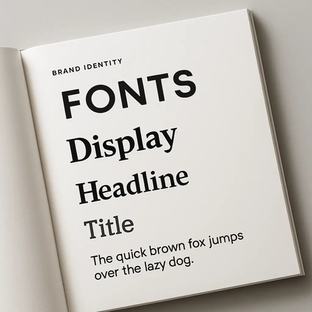
Master choosing the right fonts for your brand. Learn font psychology, pairing, and legibility to craft a powerful brand identity that connects with your audience.