
Window Graphics: Turn Your Storefront into a 24/7 Billboard
Transform your storefront into a 24/7 billboard! Discover how store window graphics, from decals to lettering, boost visibility, attract customers, and enhance your brand.
In a crowded digital marketplace, your first impression is almost always visual. Before a potential customer reads a single word, they see your brand. This initial interaction is shaped by your visual identity—the cohesive system of colors, fonts, and logos that communicates who you are. A strong visual identity does more than just look good; it builds recognition, fosters trust, and conveys your unique brand personality at a glance. When your brand colors and brand fonts are chosen strategically, they create a powerful and memorable experience. This guide is your complete roadmap to moving beyond random choices and learning to master brand visuals. We will explore the core principles of color psychology and font pairing to help you build an identity that is not only beautiful but also strategically sound, ensuring consistency and impact across every touchpoint.
Before you choose a single hue or typeface, you must lay the groundwork. The most effective visual identity is a direct extension of a well-defined brand personality. This is the non-negotiable first step. Ask yourself: if your brand were a person, who would it be? What are its core characteristics? Is it sophisticated and wise, like a trusted mentor? Or is it energetic and playful, like a creative friend? Brainstorm and write down a list of 5-10 core adjectives that capture this essence—words like ‘Bold,’ ‘Minimalist,’ ‘Trustworthy,’ ‘Innovative,’ or ‘Authentic.’ This list becomes your strategic compass. Every decision, from your color palette to your font pairing, will be measured against these traits. Getting this foundation right is the key to creating a cohesive system and is the first real step to master brand visuals that feel genuine and connect deeply with your audience.
Your brand personality adjectives provide the emotional direction, but your core strategy provides the purpose. Go deeper by defining your mission (what you do), values (what you believe), and target audience (who you serve). A brand whose mission is to make technology accessible will have a different visual feel than one focused on handmade luxury. Understanding your audience’s tastes and expectations is crucial. This clarity ensures your choices for your visual identity—from brand colors to fonts—are not just attractive but strategically aligned to connect with the right people.
Let’s make this tangible. Grab a pen or open a new document. Looking back at your core values and ideal audience, distill your brand’s essence into three to five defining adjectives. Are you ‘Dependable, Classic, and Warm,’ or perhaps ‘Innovative, Daring, and Sleek’? Write them down. These words form the bedrock of your brand personality and will act as your guideposts for every design decision ahead, from selecting your color palette to finalizing your font pairing.
With your brand personality adjectives in hand, it’s time to translate those feelings into a visual language. This is where the power of color psychology comes into play. Color is one of the most immediate and impactful elements of your visual identity, capable of evoking specific emotions and associations in an instant. Think about it: blue often communicates trust and dependability (think finance and tech), while green can signify health and nature, and red can create a sense of urgency or passion. Choosing your brand colors isn’t about picking your favorites; it’s a strategic decision. The goal is to select hues that directly align with and amplify your core brand personality traits. Understanding this connection is a fundamental step to master brand visuals and build a color palette that resonates deeply with your target audience before they even read a word.
Color is a powerful, non-verbal communicator. Our brains are hardwired to associate specific hues with emotions and concepts, a core principle of color psychology. For example, warm colors like red and orange often evoke feelings of energy, passion, and urgency, while cool colors like blue and green can create a sense of calm, trust, and stability. Choosing your brand colors means intentionally selecting the emotional landscape you want your audience to experience. This strategic choice is fundamental to building a cohesive and impactful visual identity.
While context matters, here are some general associations to guide your color palette decisions. Red often evokes passion, excitement, and urgency. Blue is a go-to for trust, security, and professionalism. Green typically signifies nature, health, and growth. Yellow can convey optimism and warmth, while purple often suggests creativity and wisdom, and black can feel luxurious and sophisticated. Aligning these meanings with your brand adjectives is how you begin to build a strategic and effective visual identity.
Look back at the 3-5 adjectives you chose to define your brand personality. Which one feels like the most dominant trait? With the principles of color psychology in mind, select one primary color that most powerfully embodies that feeling. This isn’t your complete color palette, but its anchor. This single, strategic choice is the foundation of your visual identity, setting the primary emotional tone and guiding the selection of your secondary and accent colors to come.
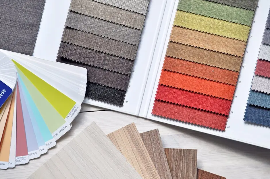
Your core color is the anchor, but a complete visual identity requires a full team of colors working in harmony. To truly master brand visuals, you must expand that single hue into a functional and balanced color palette. This isn’t about adding random colors you like; it’s about building a strategic system. A common and highly effective approach is the 60-30-10 rule, which establishes a clear hierarchy for your brand colors: a dominant primary color (60%), a supporting secondary color (30%), and a subtle accent or neutral color (10%). This structure ensures your brand is instantly recognizable while providing the flexibility needed for different marketing materials, from your website to social media graphics. Creating this cohesive system is what elevates your design from arbitrary to intentional, forming the backbone of a professional and memorable visual identity.
The 60-30-10 rule is a classic design principle that ensures your brand colors are balanced and visually appealing. Here’s the breakdown: your primary color should dominate, covering about 60% of the space. A complementary secondary color should take up 30%, creating contrast and interest. The final 10% is reserved for an accent color—a pop of brightness used for calls-to-action or highlights. This simple structure provides a clear visual hierarchy, preventing your color palette from becoming chaotic and strengthening your overall visual identity.
Start with the core color you already identified as your primary (60%). To find your secondary (30%), consult a color wheel. Analogous colors (neighbors to your primary) create harmony, while complementary colors (opposites) provide bold contrast—let your brand personality guide the choice. Finally, pick a distinct accent color (10%) that pops against the other two. This is perfect for buttons and highlights. This thoughtful selection process creates a versatile color palette, moving you one step closer to truly master brand visuals.
You don’t have to guess when building your color palette. Fantastic free tools can help you explore options and test combinations. Platforms like Adobe Color allow you to extract colors from an image or apply color harmony rules (like complementary or analogous). Coolors.co is another popular choice for quickly generating and refining palettes. Using these resources will help you finalize your brand colors with confidence, ensuring they work together harmoniously and strengthen your overall visual identity.

If your color palette sets the emotional mood, your typography gives your brand its voice. The fonts you use are just as critical to your visual identity, communicating personality and tone before a single word is truly read. To master brand visuals, you must go beyond defaults and make a strategic selection. The process to choose brand fonts is not just about legibility; it’s about matching the typeface’s character to your core brand personality. A modern, innovative brand might use a clean, sans-serif font, while a brand that is traditional and trustworthy may lean towards a classic serif. The goal is to build a small, cohesive font system—often involving strategic font pairing for headlines and body text—that creates a clear hierarchy and reinforces who you are. This thoughtful choice ensures your message is delivered with a consistent and recognizable voice across all platforms.
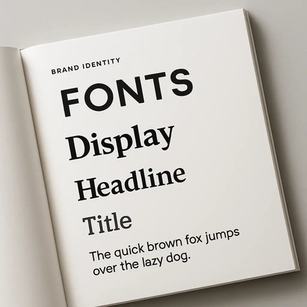
To choose brand fonts effectively, you first need to know the major categories. Serif fonts have small decorative strokes (or “feet”) and often feel traditional, trustworthy, and elegant. Sans-serif fonts lack these feet, creating a clean, modern, and accessible look perfect for digital screens. Script fonts mimic handwriting, adding a personal or artistic touch. Finally, Display fonts are bold and unique, designed for grabbing attention in headlines. Understanding these personalities is the foundation for effective font pairing and building a cohesive visual identity.
Refer back to your 3-5 brand personality adjectives. Your primary font, the one for headlines and logos, should be a direct typographic translation of these traits. It’s the star of the show. Is your brand ‘daring and modern’? A clean, geometric sans-serif might be perfect. Is it ‘elegant and traditional’? A classic serif with strong character would be ideal. When you choose brand fonts, this primary selection is the most critical as it establishes the core voice of your visual identity and sets the stage for your body text font pairing.
While your primary font provides the personality, your secondary font does the heavy lifting. This is the typeface for your body text, so legibility is non-negotiable. It must be comfortable to read in long paragraphs on any screen. The key to effective font pairing is contrast that creates clarity. A common best practice is to pair a bold serif headline with a clean sans-serif body font, or vice versa. This contrast establishes a clear visual hierarchy and ensures your visual identity is not only expressive but also highly functional.
In some cases, a third accent font can add a final layer of polish to your visual identity. This is a special, often more decorative, typeface used very sparingly for things like pull quotes, signatures, or specific callouts. It should be distinct from your primary and secondary choices but still align with your brand personality. This advanced font pairing technique adds a pop of character and helps you truly master brand visuals by creating moments of surprise and emphasis within your designs.
You’ve selected your primary and secondary fonts, but the true art lies in making them work together harmoniously. Effective font pairing is what separates an amateur design from a professional visual identity. The cardinal rule is to create contrast, not conflict. Pair a decorative headline font with a simple, highly-legible body font. A common and effective strategy is to combine a serif with a sans-serif, as their structural differences provide instant clarity and hierarchy. Beyond that, ensure your chosen brand fonts share a similar mood or x-height (the height of lowercase letters) to feel like they belong together. The goal is to establish a clear visual order that guides the reader’s eye effortlessly. Limit yourself to two, or at most three, fonts to avoid visual clutter. By following these guidelines, you create a cohesive and functional typographic system, a critical step to master brand visuals and ensure your message is always clear and on-brand.
The goal of effective font pairing is to create a clear visual roadmap for the reader. Establish hierarchy by using your primary font in a larger size or bolder weight for headlines, while your secondary font remains simple and smaller for body text. This contrast guides the eye instantly. For harmony, ensure your chosen brand fonts share a similar mood or x-height, so they feel like part of a cohesive family. This intentional system prevents visual clashes and is key to a functional, professional visual identity.
The golden rule of effective font pairing is to create clear contrast between your chosen typefaces. This means ensuring your headline font and your body text font are visually distinct enough to establish an immediate hierarchy. A classic, high-contrast pairing is a bold serif headline with a clean, simple sans-serif body text; their different structures signal different purposes to the reader’s eye. Conflict arises when you pair two fonts that are too similar—for example, two slightly different geometric sans-serifs. This creates a subtle, unsettling visual competition that looks amateurish and hinders readability. The goal is to select brand fonts that complement each other through their differences in weight, style, and structure. Getting this balance right is a fundamental skill to master brand visuals, as it ensures your message is not only stylish but also effortlessly clear, reinforcing a professional and well-thought-out visual identity.
While contrast creates hierarchy, harmony creates a unified story. Your chosen brand fonts should feel like they belong to the same family, even if they serve different functions. This is where a shared mood comes into play. Refer back to your brand personality adjectives. If your brand is ‘elegant and timeless,’ a pairing of a classic serif and a humanist sans-serif feels cohesive because both exude a sense of tradition and readability. If your brand is ‘techy and futuristic,’ two different geometric sans-serifs (one bold, one light) can work because they share a clean, modern DNA. A great way to achieve this is to look at fonts from a similar design era or from the same type foundry, as they often share underlying structural traits like x-height and letter proportions. This level of intentionality in your font pairing is what creates a sophisticated and believable visual identity, showing you truly know how to master brand visuals.
Beyond choosing the right fonts, how you use them is paramount. A typographic hierarchy is a system that uses size, weight, and spacing to guide the reader’s eye, telling them what to read first. This is a critical element of your visual identity that separates professional design from an amateur “wall of text.” Your primary font should be used for your main headlines (H1), likely in a larger size and bolder weight. Subheadings (H2, H3) can use the same font in a smaller size or a lighter weight to create distinction. Your secondary font is reserved for body text, optimized for readability. Don’t forget to use your accent color sparingly for links or key callouts to add another layer of guidance. By creating these clear levels of importance, your content becomes scannable and digestible, proving you can master brand visuals that are not just beautiful but highly functional.
While following best practices is key, knowing what not to do is just as crucial for effective font pairing. One of the most common errors is choosing fonts that are too similar—like two slightly different geometric sans-serifs—which creates visual conflict instead of helpful contrast. Another frequent mistake is using too many brand fonts; sticking to two (or three, at most) prevents a chaotic look and strengthens your visual identity. A critical failure is prioritizing style over substance by using a decorative or script font for long paragraphs of body text, destroying readability. Finally, be wary of pairing fonts with clashing personalities, such as a formal serif with a playful script, as this sends a confused message about your brand personality. Avoiding these pitfalls is a significant step toward a polished, professional result and is essential to truly master brand visuals that communicate with clarity and purpose.

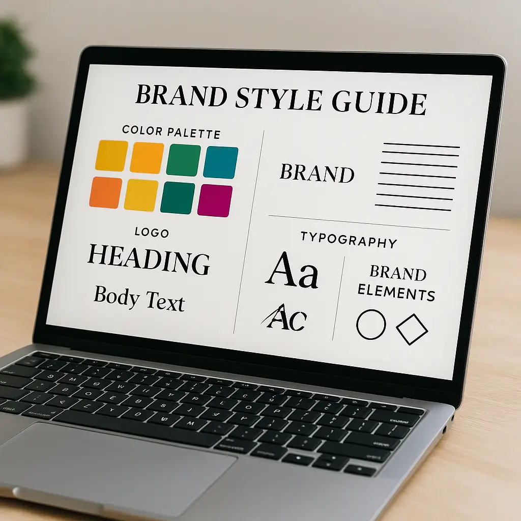
You’ve defined your personality, chosen your colors, and selected your fonts. Now, how do you ensure this hard work is applied consistently? The answer is by creating a brand style guide. This document is the single source of truth for your entire visual identity, a comprehensive rulebook that details exactly how your brand should look and feel. It codifies your official color palette (including specific hex codes for your brand colors), defines your primary and secondary brand fonts, and outlines the rules for your font pairing and typographic hierarchy. It also includes guidelines for logo usage, ensuring it’s never stretched or misused. This guide is the key to maintaining a cohesive presence across every marketing channel, empowering anyone—from an intern to a new agency—to represent your brand correctly. Creating these brand guidelines is the final, crucial step to truly master brand visuals and protect the integrity of your hard-earned brand.
Consistency is the engine of brand recognition. Every time a customer encounters your brand, seeing the same consistent brand colors and brand fonts reinforces their memory of you. This repetition builds a powerful sense of familiarity and, more importantly, trust. An inconsistent visual identity can feel chaotic and unprofessional, eroding confidence. Your brand guidelines are the tool that ensures every single touchpoint works together, turning scattered impressions into a unified, memorable brand experience that builds lasting equity.
Your brand guidelines must be specific to eliminate any guesswork. For your color palette, list the exact values for each of your brand colors—include HEX codes for digital use and RGB/CMYK for versatility. For typography, clearly name your primary and secondary brand fonts. The most critical part is defining the usage rules: specify which font, size, and weight to use for headlines (H1, H2) versus body text. This granular detail ensures anyone can apply your visual identity correctly, guaranteeing consistency across all materials.
Your brand guidelines are the blueprint; now it’s time to build. Diligently apply your visual identity across every platform. Your website’s main headline should use the same primary brand font as your social media templates. The accent color from your color palette should be used for call-to-action buttons on both your site and in email campaigns. This consistent execution—from business cards to digital ads—is what creates a memorable brand experience and is a critical step to truly master brand visuals and build recognition.
We’ve journeyed from the abstract core of your brand personality to the tangible details that form a cohesive visual identity. By intentionally selecting your brand colors based on psychology and building a balanced color palette, you’ve set the emotional stage for your audience. By carefully choosing your brand fonts and mastering the art of font pairing, you’ve given your brand a clear and consistent voice. The final step of documenting everything in a set of brand guidelines ensures this voice remains strong and unwavering across every platform. Remember, these elements are more than just design choices; they are a powerful form of communication. You now possess the complete strategic framework needed to master brand visuals, creating an identity that is not only beautiful but builds recognition, fosters trust, and speaks directly to the people you want to reach.
Transform your storefront into a 24/7 billboard! Discover how store window graphics, from decals to lettering, boost visibility, attract customers, and enhance your brand.

Choosing the best CMS for your business? Compare WordPress, Shopify, and Squarespace side-by-side to find the ideal platform for your online store or website.
Master choosing the right fonts for your brand. Learn font psychology, pairing, and legibility to craft a powerful brand identity that connects with your audience.