Introduction: Why Your Font Choice Matters More Than You Think
Think about your favorite brand. Beyond the logo or colors, the style of the letters themselves likely sends a powerful message. That’s typography in action, and it’s a critical, often-overlooked, element of a strong brand identity. The fonts you choose are the visual voice of your business; they convey your brand personality and values before a customer even reads a single word. A sleek, modern typeface whispers “innovation,” while a classic serif font can project tradition and reliability. Making the right decision when you choose fonts for your brand is a fundamental step. These branding fonts will appear on everything from your website to your packaging, influencing perception and building recognition at every touchpoint. This guide will demystify the process, helping you select brand identity fonts that not only look great but also work strategically for your business.
Step 1: Define Your Brand’s Personality

Before you even begin to browse typefaces, you must first look inward. The entire process to choose fonts for your brand hinges on one critical question: who are you? Your fonts are the visual shorthand for your company’s character, so defining your brand personality is the non-negotiable first step. Is your brand innovative and bold, or traditional and trustworthy? Is it playful and energetic, or sophisticated and luxurious? Take a moment to brainstorm and write down 3-5 core adjectives that capture your brand’s essence (e.g., “Friendly, Organic, Simple”). This list will become your compass, guiding every subsequent decision. Having this clarity ensures your chosen branding fonts are not just a stylistic whim, but a strategic tool that accurately reflects your identity and connects with your target audience on an emotional level.
Are You Modern, Traditional, Playful, or Sophisticated?
Let’s translate the adjectives you just brainstormed into tangible brand archetypes. A modern brand might use words like “sleek” or “innovative,” pointing toward clean, minimalist fonts. A traditional brand personality values trust and history, often leaning towards established, classic typefaces. Is your brand playful and energetic? This suggests more rounded or expressive fonts. Or is it sophisticated and luxurious, requiring elegant and refined typography? Identifying your archetype is a crucial step to narrow your search for the perfect branding fonts.
Identifying Your Target Audience’s Aesthetic
Your brand personality is established, but who are you speaking to? The most effective branding fonts resonate not just with your company, but also with the aesthetic of your target audience. Consider their expectations and visual language. A font that feels luxurious to one group might seem intimidating or outdated to another. Aligning your typography with your audience’s preferences is a critical step to choose fonts for your brand that build rapport and feel instantly familiar, ensuring your message is not just seen but felt.
Step 2: Understand the Core Font Families

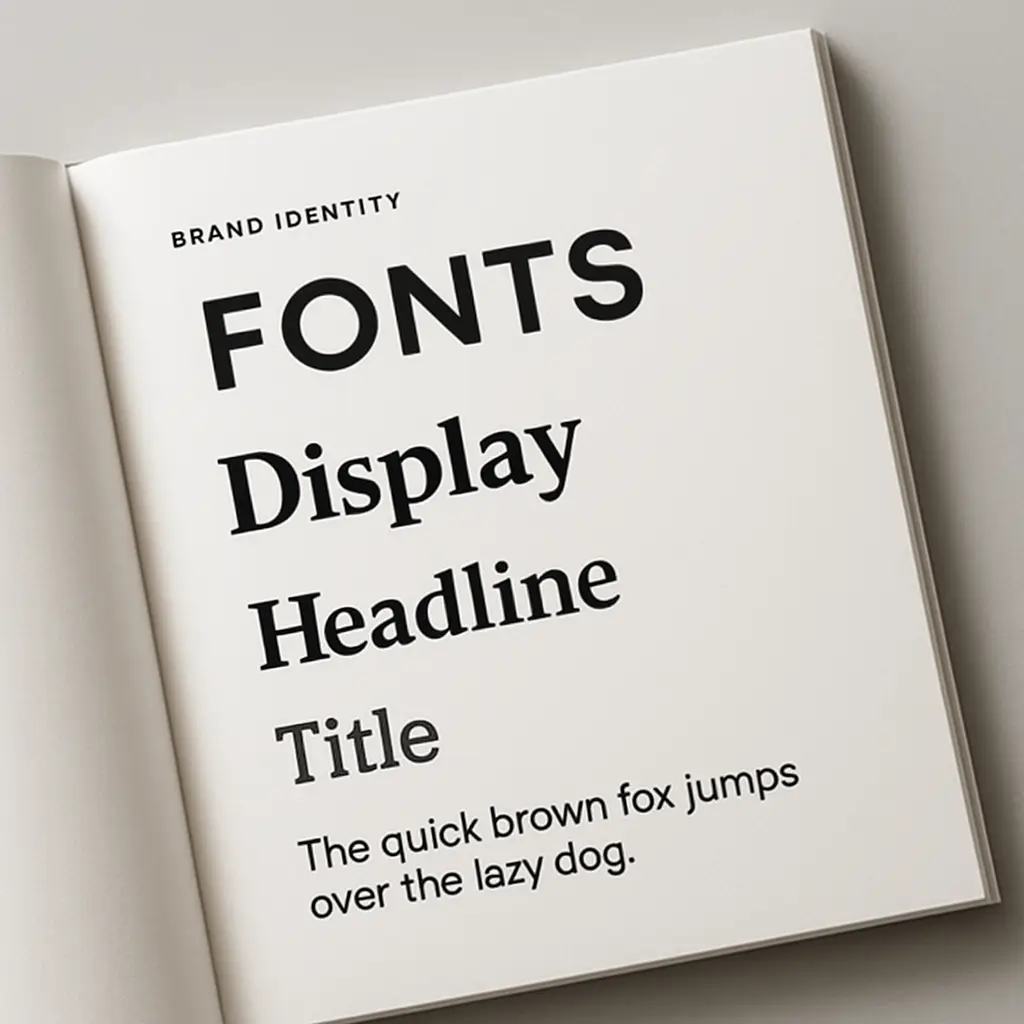
Now that you have your brand personality adjectives, it’s time to learn the language of typography. You don’t need to be a designer, but understanding the main categories is essential when you choose fonts for your brand. The vast world of type is built on four core families: Serif, Sans-Serif, Script, and Display. Each has a distinct character rooted in font psychology. Serifs feel classic and authoritative; Sans-Serifs are modern and clean; Scripts are elegant or personal; and Display fonts are bold and expressive. Think of these families as your foundational toolkit. Grasping the emotional and visual difference—especially in the classic serif vs sans serif debate—is the most critical technical step in your journey. This knowledge transforms your selection from a random guess into an informed, strategic decision, ensuring your chosen branding fonts actively work to build your identity.
Serif Fonts: For a Classic and Trustworthy Feel
Serif fonts are characterized by the small decorative strokes, or “feet,” at the ends of their letters. This classic style, rooted in traditional print, lends an air of authority, tradition, and reliability. The inherent font psychology of these typefaces makes them an excellent choice for brands aiming to project stability and expertise—think financial institutions, universities, or luxury goods. Their structure also provides excellent font legibility in long-form text, making them a dependable and trustworthy option for your core branding fonts.
Sans-Serif Fonts: For a Clean, Modern, and Simple Look
As their name implies, “sans-serif” fonts are those without the small decorative feet. This creates a clean, minimalist, and contemporary aesthetic. The inherent font psychology of these typefaces suggests approachability, efficiency, and clarity, making them a popular choice for tech companies, startups, and modern lifestyle brands. In the great serif vs sans serif debate, these branding fonts are prized for their exceptional font legibility on digital screens, ensuring your message is crisp and easy to read on websites and apps.
Script Fonts: For Elegance and a Personal Touch
Script fonts mimic the fluid strokes of handwriting and calligraphy, offering a spectrum from formal and elegant to casual and friendly. This font family is steeped in a font psychology of creativity, sophistication, and a deep personal connection. They are an excellent choice when you want to add a human touch to your brand. While their intricate nature often reduces font legibility in long paragraphs, they excel as a powerful logo font or for short, impactful headings to convey a sense of artistry or bespoke quality.
Display Fonts: For Making a Bold, Unique Statement
Display fonts are the bold, eccentric personalities of the typography world, designed specifically to grab attention. They are often unique, decorative, and packed with character, making them a perfect choice for a powerful logo font or impactful headlines. The font psychology here is all about making an unforgettable statement and conveying a specific theme or mood. However, their highly stylized nature often comes at the cost of font legibility, so they should be used sparingly and never for long-form text or small paragraphs.
Step 3: Master the Art of Font Pairing

A single font rarely tells the whole story. The true magic in developing a compelling visual identity often lies in the thoughtful combination of two or three typefaces—a practice known as font pairing. The goal isn’t to find two fonts that are nearly identical, but rather to create a harmonious contrast that establishes a clear visual hierarchy for the reader. A great font pairing ensures your design is dynamic and engaging without feeling chaotic. Think of it as selecting a primary font (often for headlines or your logo font) and a secondary font (for body text) that complement each other. This strategic combination of your branding fonts is a fundamental skill when you choose fonts for your brand, transforming a simple design into a sophisticated and effective communication tool that strengthens your entire set of brand identity fonts.
The Golden Rule: Strive for Contrast, Not Conflict
The key to effective font pairing is to find two typefaces that are different enough to establish a clear visual hierarchy, but complementary enough in mood to feel cohesive. Contrast is what makes your headlines pop and your body text readable—think pairing a bold sans-serif with a classic serif. Conflict arises when fonts are too similar (creating visual confusion) or too wildly different (creating chaos). Mastering this balance is essential when you choose fonts for your brand to ensure a polished and professional look.
How Many Fonts Should a Brand Use? (The 2-3 Font Rule)
For a professional and cohesive look, stick to the two-to-three font rule. While it’s tempting to use many styles, limiting your selection to a primary font (for headlines), a secondary font (for body text), and an optional accent font creates a strong visual system. Using more than three branding fonts can make your communications feel cluttered and unfocused, undermining your brand identity. This disciplined approach to font pairing ensures consistency and makes it easier to choose fonts for your brand that build recognition.
Tools and Inspiration for Font Combinations
Finding the perfect match can feel daunting, but you don’t have to guess. Excellent online resources exist to simplify font pairing. Google Fonts, for example, suggests popular and effective pairings directly on each font’s page. For more dynamic discovery, tools like Fontjoy use AI to generate complementary combinations instantly. Using these platforms removes the guesswork, providing visual inspiration and pre-vetted options as you choose fonts for your brand, helping you finalize your core brand identity fonts with confidence.
Step 4: Prioritize Legibility and Accessibility
You’ve defined your personality and found a beautiful font pairing, but there’s a critical test your selections must pass: can people actually read them? This is where font legibility becomes the most important factor. A stylish font is useless if your message is unclear. Legibility is about how easily a reader can distinguish individual letters, while readability refers to how easily they can scan entire blocks of text. Your chosen branding fonts must perform flawlessly in both scenarios—from a small mobile screen to a large print ad. This consideration is also the cornerstone of web accessibility, ensuring your content is available to all users, including those with visual impairments. When you choose fonts for your brand, prioritizing clarity isn’t a compromise on style; it’s a non-negotiable requirement for effective and inclusive communication.
Testing Readability on Different Screens and Sizes
A font’s performance isn’t theoretical; it must be tested in real-world scenarios. The typeface that looks crisp on your designer’s monitor might become an illegible blur on a smartphone screen. Before finalizing your decision, create mockups and view them on various devices—desktop, tablet, and mobile. Critically, also print a sample page. This step is vital to evaluate font legibility for both digital and physical applications, ensuring your branding fonts are clear and effective at every single size and touchpoint.
Understanding Kerning, tracking, and leading
Beyond choosing a font, the spacing between letters and lines directly impacts font legibility. These micro-adjustments are known as kerning, tracking, and leading. Kerning is the space between two specific letters, tracking is the overall spacing of a word, and leading (or line-height) is the vertical space between lines of text. Properly adjusting these elements prevents text from feeling cramped or disjointed, significantly improving readability and giving your branding fonts a professional, polished finish.
Step 5: Test Your Fonts in Real-World Scenarios

Theory is one thing, but application is everything. You’ve defined your personality, mastered font pairing, and prioritized legibility, but now it’s time for the final reality check. Before you commit to your selections, you must see how your chosen branding fonts behave in the wild. This means creating realistic mockups of your key brand assets. How does your headline font look on a website banner? Is your body text font clear in a long paragraph on a mobile app? How does your potential logo font look on a business card or a social media graphic? This crucial testing phase ensures your chosen brand identity fonts not only look good in isolation but work together harmoniously to build a strong, cohesive visual system. This is the last and most practical step when you choose fonts for your brand, confirming that they effectively communicate your intended message across every touchpoint.
Mocking Up Your Fonts on Logos, Websites, and marketing materials
To truly test your selections, create mockups of your most critical assets. Apply your chosen headline font to a website banner and see how it works as a potential logo font. Use your body text font in a sample blog post or on a social media graphic. Don’t forget physical items like business cards or packaging. This practical step reveals how your chosen brand identity fonts function as a cohesive system, confirming they maintain their intended personality and clarity across all marketing materials.
Gathering Feedback Before Finalizing Your Choice
You’re likely too close to the project to be objective. Before you lock in your decision, share your mockups with a few people who represent your target audience. Don’t just ask if they “like” it; ask what feelings or qualities the fonts evoke. Does it match the brand personality you defined in Step 1? This real-world feedback is the final validation you need when you choose fonts for your brand, ensuring your chosen brand identity fonts resonate with the people you want to reach.
Conclusion: Solidifying Your Brand’s Typographic Voice
Choosing the right fonts for your brand is a journey that goes far beyond simply picking what looks good. It’s a deliberate, strategic process that transforms abstract ideas about your brand personality into a tangible visual language. By following these steps—from defining your core identity and understanding font psychology to mastering font pairing and testing for font legibility—you have built a robust system for your brand identity fonts. The branding fonts you’ve selected are no longer just letters on a page; they are a powerful asset, a consistent voice that will speak for your business across every website, logo, and package. When you consciously choose fonts for your brand with this level of intention, you’re not just designing; you are building a lasting and recognizable identity. This new typographic voice will now work tirelessly to communicate your values and connect with your audience, solidifying your place in the market.