
Design Effective Vehicle Wraps That Turn Heads
Learn to design effective vehicle wraps that turn heads and boost your brand. Get expert design tips for mobile advertising success, ensuring clarity and impact on the road.

Imagine you have just three seconds to get your message across. For most business signage, that’s the reality. This “3-second rule” dictates that a potential customer, whether driving past or walking by, must be able to see, read, and comprehend your sign in that tiny window of time. If they can’t, the opportunity is lost. This challenge underscores the importance of exceptional sign visibility and instant sign readability. So, how do you pass the test? The single most critical factor is the strategic use of color and contrast in signs. The right pairing of a background and text color can make your message pop, while a poor choice renders it nearly invisible. In this guide, we’ll explore the best colors for signs and provide the essential signage design tips to ensure your message always hits its mark.

A sign’s effectiveness doesn’t exist in a vacuum; it’s directly tied to its environment. Before settling on sign color combinations, analyze the physical backdrop. Will your sign be mounted on a red brick wall, set against a busy urban landscape, or surrounded by green foliage? The goal is to choose colors that create strong separation from the surroundings to maximize sign visibility. A green and brown sign, for example, would disappear against a backdrop of trees. The same principle applies to lighting. In bright daylight, only high contrast signs will maintain their sign readability without looking washed out. At night, the dynamic shifts. For illuminated signs, a dark background and text color pairing, like white text on a black or deep blue background, is often superior. The light letters will appear to glow, making your message pop in the darkness. Mastering color and contrast in signs means planning for a 24/7 world.
Think of your sign as a functional product; its primary “use” is to be read. This is especially true for informational or directional signs. A prime example is ADA compliant signs, which have strict regulations to ensure they are usable by people with visual impairments. For these, achieving high contrast isn’t just a tip—it’s a legal requirement. These standards mandate non-glare finishes and specific light-on-dark or dark-on-light color pairings, making them the ultimate case study in prioritizing pure sign readability over creative flair.
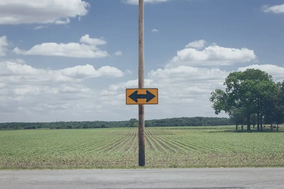
The distance from which your audience will see your sign is a massive factor in its design. A sign meant for pedestrians on a sidewalk has different needs than one aimed at drivers on a highway. The further the viewing distance, the more crucial high contrast signs become to ensure overall sign visibility. From afar, colors with low contrast tend to blur together, turning your carefully crafted message into an illegible smudge. This is where the best colors for signs, like black on yellow or white on blue, truly shine, maintaining their crispness over long distances. Simple sign color combinations are key; avoid intricate palettes or subtle gradients that require close inspection. The goal is to maximize sign readability at a glance. Effective use of color and contrast in signs ensures your message is just as powerful from 50 yards away as it is from 5 feet, guaranteeing you capture every possible opportunity.

In the world of signage, complexity is the enemy of speed. When a potential customer glances at your sign, their brain has a fraction of a second to process the information. Overloading it with too many colors, competing graphics, or intricate fonts creates “visual noise” that undermines comprehension. This is why one of the most vital signage design tips is to embrace simplicity. The most effective sign color combinations are often the most basic, typically limited to two or three distinct colors. This minimalist approach maximizes sign readability by creating a clean, uncluttered canvas where your message can shine. A simple, bold pairing of a solid background and text color will always be more effective than a busy photograph behind text. Ultimately, the strategic use of color and contrast in signs is about clear communication; creating a powerful, high contrast sign ensures your message isn’t just seen, but instantly understood.

While grabbing attention is key, ensuring your message is accessible to everyone is paramount. This is where the Americans with Disabilities Act (ADA) provides clear, non-negotiable rules for color and contrast in signs. For permanent architectural and directional signs, the ADA mandates a high level of contrast—specifically, a 70% difference in Light Reflectance Value (LRV) between the background and text color. This regulation is designed to maximize sign readability for individuals with visual impairments, making it a legal and ethical imperative. This is why classic sign color combinations like white on black, or dark text on a light beige, are standard for ADA compliant signs. These high contrast signs eliminate ambiguity and ensure that crucial information is universally understood. Adhering to these guidelines isn’t just about compliance; it’s about embracing inclusive design and demonstrating that your business values clear communication for every single visitor.
Choosing the right sign color combinations is less about personal preference and more about strategic science. The difference between a sign that converts and one that gets ignored often comes down to this single decision. To ensure you make the right choice, run through this quick mental checklist. First, where will the sign live? Assess its physical background and lighting conditions to ensure your colors won’t blend in. Second, who will be reading it and from what distance? The further away your audience, the more critical it is to use high contrast signs. Third, is the design simple? Limit your palette to two or three strong colors to maximize immediate sign readability. Finally, and most critically, does it pop? Prioritizing powerful contrast is the most important element of using color and contrast in signs effectively. By following these steps, you’ll select the best colors for signs that command attention and drive results.
Learn to design effective vehicle wraps that turn heads and boost your brand. Get expert design tips for mobile advertising success, ensuring clarity and impact on the road.

Navigate Toronto sign permits and bylaws for your small business. This guide simplifies the application process, types of signs, and avoids costly penalties.

Explore the future of retail with in-store interactive signage trends. Boost customer engagement, bridge digital/physical gaps, and unlock data with AI, AR, and phygital tech.