
Design Effective Vehicle Wraps That Turn Heads
Learn to design effective vehicle wraps that turn heads and boost your brand. Get expert design tips for mobile advertising success, ensuring clarity and impact on the road.
Imagine your company car, truck, or van as more than just a way to get from A to B. See it for what it truly is: a powerful, 24/7 mobile billboard. Every mile you drive transforms your vehicle into a prime piece of advertising real estate, reaching thousands of potential customers daily. This form of mobile advertising is one of the most cost-effective ways to boost brand visibility. However, simply covering your car in vinyl isn’t enough. The success of this investment hinges entirely on a strategic and thoughtful vehicle wrap design. An exceptional design captures attention in seconds, communicates your core message clearly, and solidifies your brand identity. A poor one, however, can be confusing, illegible, and a wasted opportunity. In this guide, we’ll explore the essential design tips you need to create effective vehicle wraps that don’t just get noticed—they get results.
Before you even begin exploring layouts or flashy vehicle graphics, the most crucial step is to anchor your project in a solid brand identity. Your vehicle wrap isn’t a standalone advertisement; it is a powerful, mobile extension of your business. Therefore, your established logo, core brand colors, and specific typography are the essential building blocks for your entire design. The goal is for your wrap to be instantly recognizable, creating a seamless experience for anyone who has interacted with your website, social media, or other marketing materials. This consistency is key to building trust and recall. A well-defined brand provides the necessary guardrails for your vehicle wrap design, ensuring the final product is cohesive, professional, and authentically represents your company. It’s the foundation upon which all effective vehicle wraps are built, transforming a simple design into a strategic marketing tool.
With your brand identity confirmed, distill it into its most potent elements for your custom vehicle wraps. Your core message must be incredibly concise—think a powerful tagline, not a paragraph. Your logo is the visual hero; it should be high-resolution and placed for maximum impact. Finally, your brand colors are what will make your vehicle pop in traffic. Using them boldly is a key part of an effective vehicle wrap design, creating instant recognition and making your vehicle an unforgettable mobile asset.
Your vehicle wrap doesn’t operate in a vacuum; it’s a key player in your overall marketing strategy. To maximize its impact, the design must present a unified front with your other channels, from your website and social media profiles to your print materials. This consistency reinforces your brand identity, building familiarity and trust with your audience. When a potential customer sees your van, it should instantly click with the brochure they saw last week. This cohesive approach turns your mobile advertising into a powerful amplifier for all your marketing efforts.
Beyond establishing your brand, the next step is to define a single, primary objective for your wrap. What is the number one action you want someone to take after seeing your vehicle for three seconds in traffic? Are you aiming for broad brand awareness, where the goal is simply for people to recognize your logo and company name? Or are you focused on direct lead generation, pushing for immediate phone calls or website visits? This singular goal is the most critical of all our design tips because it dictates the entire visual hierarchy of your vehicle wrap design. For awareness, your logo can be the oversized hero. For leads, your phone number and website must be massive and impossible to miss. Trying to achieve too much at once results in a cluttered, ineffective mess. The most effective vehicle wraps are ruthlessly focused, making your mobile advertising investment work smarter for you.
Pinpoint your primary call-to-action (CTA). Is it “Call for a free estimate,” or is it “Visit our website to see our portfolio”? This decision is a cornerstone of your vehicle wrap design strategy. Resisting the urge to list a phone number, website, and multiple social media handles is one of the most critical design tips. Instead, choose the one action that directly supports your main goal and make that contact information the most prominent element after your logo. This clarity ensures your message is instantly understood.
Your chosen goal directly impacts the layout of your vehicle wrap design. If your objective is brand awareness, the focus is on creating memorable and eye-catching car wraps. Your logo should be oversized and your company name prominent, making your brand identity the undeniable star. In contrast, a direct lead generation goal requires a different approach. Here, your contact information—a massive, high-contrast phone number or website URL—becomes the most important visual element, transforming your wrap into an immediate call-to-action tool.
In the world of mobile advertising, you have a fleeting window of opportunity—often less than five seconds—to make a lasting impression. This is the “5-Second Rule,” and it should be the guiding principle of your entire vehicle wrap design. A car or truck covered in paragraphs of text, competing bullet points, and multiple contact numbers becomes illegible visual noise at 40 miles per hour. The most effective vehicle wraps master the art of subtraction. They prioritize clarity over complexity, using bold graphics and ample negative space to make the essential elements—your logo, company name, and one primary call-to-action—stand out dramatically. Resisting the temptation to fill every inch of vinyl is what separates a confusing, forgettable design from a powerful and memorable marketing tool. A simple, bold approach isn’t just a stylistic choice; it’s a strategic necessity for success.
Unlike a static billboard or a print ad, your vehicle is in constant motion—and so is your audience. Drivers are focused on the road, and pedestrians only have a moment to glance over. A cluttered layout with too many messages, competing vehicle graphics, and multiple contact points becomes an illegible blur at speed. By simplifying your vehicle wrap design, you use negative space to your advantage, forcing the viewer’s eye to the most critical information and making your message instantly digestible and memorable.
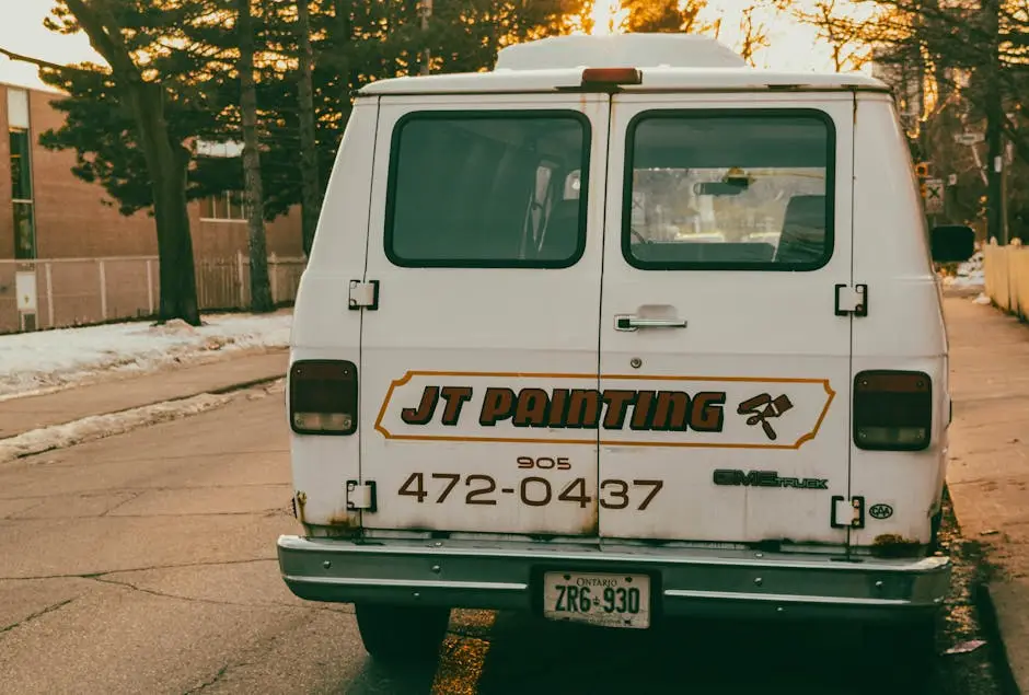
To make your vehicle wrap design effective, strip it down to three core pieces of information. First, your company name and logo (who you are). Second, a very short tagline or service description like “Luxury Landscaping” (what you do). Finally, your single most important contact point—either a phone number or a website (how to reach you). Anything else is likely clutter that undermines your mobile advertising effort. This ruthless prioritization is what allows your message to be understood and remembered in a quick glance.
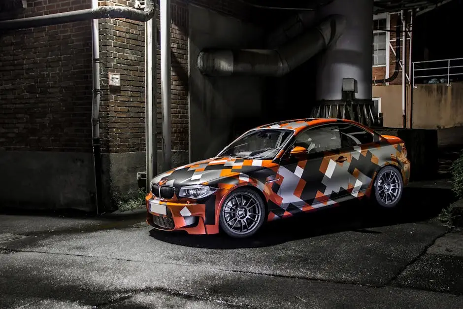
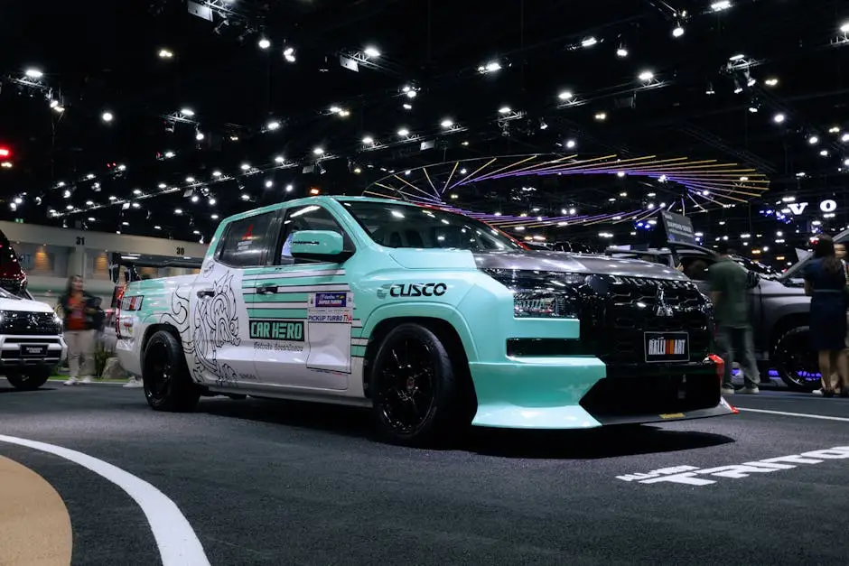
Your choice of color is one of the most influential factors in creating truly eye-catching car wraps. While you must stay true to your established brand identity, this is the place to be bold. The road is dominated by white, black, and silver vehicles; a vibrant wrap will immediately stand out and command attention. Beyond simple boldness, the key to readability is high contrast. This means pairing light and dark elements strategically. Think bright yellow text on a matte black background, or a deep blue logo on a crisp white surface. This ensures your company name, website, or phone number is instantly legible from a distance, even at high speeds. A low-contrast design becomes an unreadable blur, rendering your investment ineffective. Strategic color and contrast are foundational to any successful vehicle wrap design, transforming your vehicle from just another car into a powerful piece of mobile advertising.
Colors do more than just make your wrap visible; they trigger powerful psychological responses that shape perception. When planning your vehicle wrap design, consider what your brand colors communicate. A deep blue might convey trust and security, ideal for a financial service, while a vibrant orange can suggest creativity and energy, perfect for a marketing agency. Aligning your color palette with your brand identity and core message ensures your wrap doesn’t just get noticed—it sends the right subconscious signal to potential customers, enhancing your ad’s impact.
Think about the typical road environment: a sea of white, black, and silver vehicles. To create truly eye-catching car wraps, your palette must deliberately break from this norm. Saturated colors like electric blue, deep red, or vibrant orange will instantly command attention. However, the most critical part of your vehicle wrap design is ensuring high contrast between this background color and your text. A bright base with dark, bold lettering is far more effective than a design where colors blend, ensuring your message is legible in a split second.
Once you’ve chosen bold, high-contrast colors, your typography is the next critical element that determines whether your message is understood or ignored. Your font choice can make or break your entire vehicle wrap design. While elegant script or complex decorative fonts may align with your brand identity on paper, they become illegible at speed and from a distance. For effective vehicle wraps, the rule is simple: prioritize clarity. Opt for clean, bold, and easy-to-read sans-serif fonts like Helvetica, Arial, or Franklin Gothic. These typefaces are designed for maximum legibility. Furthermore, ensure the font size is substantial, especially for your key contact information. What looks large on a computer screen can appear minuscule from 50 feet away in traffic. Smart typography is not just about style; it’s a fundamental requirement for successful mobile advertising, ensuring your message is delivered with absolute clarity in a split second.
The golden rule for your vehicle wrap design is to choose fonts for clarity, not complexity. Steer clear of script, cursive, or overly thin fonts, as they become an illegible blur from more than a few feet away. Instead, opt for bold, clean, sans-serif typefaces. Think of classic workhorses like Helvetica, Arial, or Franklin Gothic. These fonts are engineered for instant legibility, a non-negotiable trait for effective vehicle wraps. This simple choice ensures your core message is absorbed instantly and accurately.
It can be tempting to use an elegant script or a unique, stylized font that reflects your brand’s personality. However, these are a major pitfall in vehicle wrap design. Complex fonts with thin lines, flourishes, or cursive elements become completely illegible from even a short distance, especially when the vehicle is in motion. Your critical message gets lost, rendering your mobile advertising investment useless. To create effective vehicle wraps, always prioritize legibility over intricate style, ensuring your message is understood in an instant.
Just as poor typography can ruin readability, low-resolution graphics can destroy your wrap’s credibility. A pixelated logo or a blurry photograph makes your business look amateurish and undermines the entire investment. For a professional vehicle wrap design, it is absolutely essential to start with high-quality source files. Your company logo should always be in a vector format (like an .AI or .EPS file), which allows it to be scaled to any size without losing sharpness. If you must use photographs, they need to be of an extremely high resolution. What looks clear on a business card or website will become a fuzzy, unprofessional mess when stretched across the side of a van. Insisting on crisp, clean vehicle graphics is a non-negotiable step in creating effective vehicle wraps that enhance your brand identity and project quality and trustworthiness to every potential customer on the road.
When it comes to your logo and other core vehicle graphics, vector files are non-negotiable. Files like Adobe Illustrator (.AI) or .EPS are built with mathematical paths, not pixels. This means they can be scaled from the size of a business card to the side of a semi-truck without losing any quality or becoming blurry. Submitting a pixel-based file like a JPG for your logo is a common mistake that leads to a fuzzy, unprofessional finish. Using vector files is a fundamental part of a professional vehicle wrap design.
While vector is ideal for logos, sometimes a photograph is essential for your vehicle graphics. In these cases, using high-resolution imagery is critical to avoid a pixelated, unprofessional result. A low-quality photo stretched across a door will instantly undermine your brand identity and make your wrap look cheap. As a crucial design tip, ensure any photograph used in your vehicle wrap design is provided in its original, large-format file. This guarantees your wrap looks sharp, credible, and professional on the road.
A vehicle is a three-dimensional object, not a flat canvas. This might seem obvious, but it is one of the most overlooked aspects of an amateur vehicle wrap design. Every car, truck, and van has a unique architecture of curves, contours, door handles, windows, and panel gaps that can distort or completely hide your message. A truly professional approach requires designing for the specific make and model. This means using a precise vehicle template to strategically place your key vehicle graphics and contact information. One of our most critical design tips is ensuring your logo isn’t bisected by a door seam or your phone number isn’t warped into an unreadable state over a wheel well. The most effective vehicle wraps place essential information on the largest, flattest surfaces—like the sides and back—to guarantee legibility. Working with the vehicle’s shape ensures your message is clear and powerful from every angle.
A common pitfall in vehicle wrap design is treating the car like a flat poster instead of a 3D sculpture. A professional designer considers how vehicle graphics will flow over a fender or how your logo appears from a 45-degree angle. Truly great car wrap ideas use the vehicle’s natural lines to guide the viewer’s eye toward the most critical information. This holistic, three-dimensional thinking is what ensures your message remains clear and impactful from every vantage point, creating truly effective vehicle wraps.
The most valuable real estate for your vehicle wrap design is on the flattest surfaces. Areas like the sides and the rear of the vehicle act as prime, billboard-like canvases. Strategic placement here ensures your critical information—logo, website, or phone number—is presented without distortion from body lines, handles, or wheel wells. The rear is particularly crucial, as it gives drivers directly behind you in traffic a clear, unobstructed view. Following this simple design tip is essential for creating effective vehicle wraps that are both readable and impactful.
Even the best vehicle graphics can be ruined by poor placement. One of the most practical design tips is to map out the vehicle’s “no-go zones” before finalizing your vehicle wrap design. These obstacles include door handles, gas caps, deep body recesses, and panel seams. Placing your website URL or phone number across a handle will make it illegible, while a seam can slice your logo in half. A professional designer strategically works around these interruptions, ensuring your key text remains clean, intact, and easy to read.
A vehicle is a 360-degree marketing asset, and a comprehensive vehicle wrap design must consider every single angle. Each side serves a distinct advertising purpose. The sides of your car or truck are your primary billboards, offering the largest canvas for your company name, logo, and core vehicle graphics. They capture attention from pedestrians and drivers alongside you. The rear of the vehicle, however, is your lead-generation machine. Drivers stuck behind you in traffic have a captive audience, making it the perfect spot for your large, unmissable phone number or website URL. The front is for quick brand recognition in rearview mirrors, where a simple logo often works best. Thinking through this 360-degree experience is what separates amateur work from effective vehicle wraps that maximize your mobile advertising ROI from every possible viewpoint.
The rear of your vehicle is arguably the most valuable real estate in your entire vehicle wrap design. This is your direct lead generation powerhouse. While the sides build awareness, the back is where you convert interest into action. Drivers stopped behind you at a red light or in traffic become a captive audience with seconds, or even minutes, to spare. This makes it the undisputed best place for your primary call-to-action. A large, high-contrast phone number or a simple website URL turns your wrap into an incredibly effective mobile advertising tool.
While each side serves a unique purpose, your entire vehicle must present a unified visual story. The best car wrap ideas use repeating design elements, consistent colors, and typography that wrap seamlessly around the vehicle’s body. Your vehicle wrap design should feel like a single, intentional piece of art, not three separate advertisements stuck together. This cohesive approach ensures your brand identity is strong and consistent, making your mobile advertising look professional and memorable from every possible angle.
Designing an exceptional vehicle wrap is a blend of art and science, transforming a company vehicle into a powerful marketing machine. By following these core principles—starting with a solid brand identity, embracing bold simplicity, and prioritizing absolute clarity—you create a foundation for success. The most effective vehicle wraps are not the busiest; they are the smartest. They use high-contrast colors, legible fonts, and crisp vehicle graphics to deliver a memorable message in a matter of seconds. Now that you understand the strategy behind an impactful vehicle wrap design, the final step is to partner with a professional installation team. They have the expertise to translate your carefully crafted vision into a flawless, three-dimensional reality, ensuring your investment in mobile advertising generates returns for years to come and turns heads on every street.
Learn to design effective vehicle wraps that turn heads and boost your brand. Get expert design tips for mobile advertising success, ensuring clarity and impact on the road.

Navigate Toronto sign permits and bylaws for your small business. This guide simplifies the application process, types of signs, and avoids costly penalties.

Explore the future of retail with in-store interactive signage trends. Boost customer engagement, bridge digital/physical gaps, and unlock data with AI, AR, and phygital tech.