Window Graphics: Turn Your Storefront into a 24/7 Billboard
Transform your storefront into a 24/7 billboard! Discover how store window graphics, from decals to lettering, boost visibility, attract customers, and enhance your brand.
In the competitive digital marketplace, your website is more than an online catalog—it’s your most important salesperson, working 24/7. But is it a helpful guide or a frustrating barrier? The difference between a visitor who clicks away and one who completes a purchase often comes down to smart design. A truly high-converting e-commerce design isn’t just about aesthetics; it’s about creating a seamless and intuitive user experience (UX) that builds trust and guides customers effortlessly toward the “buy” button. Every font, button, and image placement can either boost or damage your sales potential. By focusing on key design elements that enhance usability and build confidence, you can dramatically improve your e-commerce conversion rate. This guide will walk you through the essential components that turn your site into a powerful sales engine.

If customers can’t find a product, they can’t buy it. This fundamental truth is why the foundation of any high-converting e-commerce design is effortless product discovery. Your website navigation must be intuitive, with logically organized categories and a clear menu structure that users can understand at a glance. Think like your customer: are your product groupings predictable? Alongside a great menu, a powerful and prominently displayed search bar is non-negotiable. An effective search function should handle typos, provide auto-suggestions, and offer robust filtering options (e.g., by size, price, color, or rating). These crucial design elements do more than just improve usability; they are essential for a positive user experience (UX). By minimizing friction in the discovery phase, you keep shoppers engaged on your site, reduce bounce rates, and directly boost your e-commerce conversion rate.
To craft truly effective website navigation, your menu categories must be crystal clear. Use simple, widely understood terms that your customers would use themselves—avoid internal jargon at all costs. For stores with large inventories, a well-organized ‘mega menu’ can display subcategories at a glance, drastically improving the user experience (UX). The goal is to eliminate guesswork. When a user can confidently predict what they’ll find under each heading, you reduce friction and guide them smoothly toward a purchase.
For shoppers with a specific product in mind, the search bar is their express lane. It shouldn’t just be present; it must be prominent and intelligent. A smart search bar significantly enhances the user experience (UX) by offering auto-suggestions, tolerating typos, and displaying product thumbnails within the results dropdown. This powerful functionality removes user frustration and directly shortens the path to purchase, making it an essential tool for improving your e-commerce conversion rate and creating a truly high-converting website.
Breadcrumbs are a small but mighty part of your website navigation. They act as a secondary navigation aid, showing users a clear trail of where they are on your site (e.g., Home > Men’s > Shoes > Running). This seemingly simple feature is crucial for improving the user experience (UX), as it prevents shoppers from feeling lost and allows them to easily navigate back to a previous category. By providing this clear path, you reduce frustration and keep users engaged, making breadcrumbs an essential element in a high-converting e-commerce design.
Once a customer finds what they’re looking for, the quality of your visuals takes center stage. In the digital world, your product photography and videos are the product. Since shoppers can’t touch or feel your items, your presentation must bridge that sensory gap—a cornerstone of high-converting e-commerce design. Invest in professional, high-resolution photography that showcases your products from every angle, complete with a seamless zoom function for examining details. Go beyond basic studio shots; include lifestyle images that show the product in use, helping customers visualize it in their own lives. These crucial design elements create a richer, more informative user experience (UX). High-quality visuals build confidence, reduce purchase hesitation, and create a compelling desire to buy, directly boosting your e-commerce conversion rate and turning browsers into buyers.
Professional product photos are non-negotiable for building trust and driving sales. Grainy, poorly lit, or single-angle images create doubt and make your brand seem unprofessional. To enhance the user experience (UX), provide a gallery of high-resolution images for each product, showcasing it from all relevant angles, including detailed close-ups. This visual information answers customer questions about quality, texture, and features, directly reducing purchase hesitation and contributing to a higher e-commerce conversion rate for your store.
While static photos are essential, dynamic visuals can dramatically elevate the user experience (UX). A product video demonstrates functionality and context that images alone cannot capture, showing an item in action. Likewise, a 360-degree view gives shoppers control, allowing them to inspect an item from all sides as if holding it. These interactive design elements build immense customer confidence and are hallmarks of a high-converting e-commerce design, bridging the crucial gap between browsing and buying.
Beyond individual product pages, your visual presentation must be consistent across your entire site. This means using a cohesive style for photography, a defined color palette, and uniform typography that reflects your brand identity. This consistency in your e-commerce website design creates a polished and professional feel, acting as a powerful trust signal for visitors. When every visual element works in harmony, it reinforces your brand and builds a seamless user experience (UX), a key ingredient for a truly high-converting website.
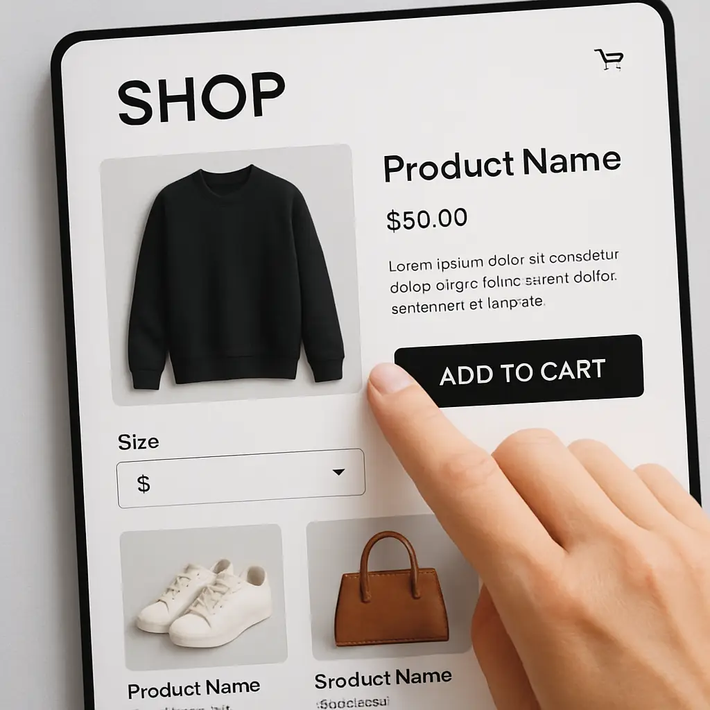
Even with perfect navigation and stunning visuals, a sale is lost if the customer doesn’t know what to do next. This is where the call to action (CTA) becomes the most critical element on the page. A truly high-converting e-commerce design hinges on the clarity and prominence of its CTAs. Buttons like “Add to Cart” or “Buy Now” are the final instructions that guide a user from browsing to buying. These crucial design elements must be visually distinct—using a bold, contrasting color and clear, action-oriented language—to stand out from the rest of the page. Ambiguity is the enemy of conversion; a vague or hidden CTA creates friction and hesitation, sabotaging the entire user experience (UX). By ensuring your CTAs are unmistakable and compelling, you remove decision-making roadblocks and provide a clear path to purchase, which is essential for boosting your e-commerce conversion rate.
To make your call to action (CTA) effective, it must be impossible to miss. Use a bold, contrasting color that pops against your page’s background while still aligning with your brand’s palette. The size must be substantial enough for effortless tapping on mobile screens, and the shape—often with slightly rounded corners—should look like a clickable button. These visual design elements are critical for creating an intuitive user experience (UX). A visually dominant CTA guides the user’s eye, making the desired action obvious and frictionless.
The text on your call to action (CTA) is just as crucial as its visual design. Use specific, action-oriented verbs that leave no room for doubt. For instance, “Add to Cart” is a low-commitment, universally understood phrase that encourages continued browsing. In contrast, a “Buy Now” button creates urgency and streamlines the path to a quick sale. Choosing the right words manages user expectations, a vital component of a positive user experience (UX), and is a simple yet powerful way to improve your e-commerce conversion rate.
Where you place your call to action (CTA) is just as vital as its design. On product pages, the primary CTA must appear “above the fold”—clearly visible without the need to scroll. This placement ensures the next step is immediately obvious. For category pages, including a secondary CTA like “Quick Add” or “View Details” on each item reduces clicks and streamlines the shopping journey. This strategic placement is one of the most effective design elements for improving the user experience (UX).
In today’s retail landscape, the path to purchase overwhelmingly begins on a smartphone. Ignoring this reality is a direct path to a low e-commerce conversion rate. A responsive or mobile-friendly design, which adapts your site’s layout to fit any screen size, is the absolute minimum requirement. However, a truly high-converting e-commerce design takes it a step further with a mobile-first philosophy, prioritizing the experience on the smallest screen from the very start. This ensures that every element, from tappable navigation to thumb-friendly CTAs and fast-loading images, is optimized for on-the-go shopping. A site that forces users to pinch and zoom creates a frustrating user experience (UX) and leads to immediate abandonment. By building your e-commerce website design for mobile users first, you cater to the modern consumer, eliminate friction, and build a foundation for maximum conversions across all devices.
A truly responsive, mobile-friendly design does more than just shrink your desktop site—it intelligently adapts. This means text is always readable without zooming, images resize gracefully, and buttons are large enough for easy tapping on any device. This seamless adaptation is fundamental to a positive user experience (UX). By ensuring your e-commerce website design works flawlessly everywhere, you eliminate a major source of customer frustration and create the frictionless journey required for a high-converting site.
A successful mobile-friendly design must prioritize two key factors: touch and speed. On mobile, every interactive element—from menu items to CTAs—must be designed for thumbs, with large tap targets and sufficient spacing to prevent accidental clicks. This focus on touch is fundamental to a frustration-free user experience (UX). At the same time, speed is paramount. Mobile shoppers are impatient; slow-loading pages lead directly to lost sales. Optimizing images and streamlining code for fast performance is a non-negotiable part of a high-converting e-commerce design that keeps users engaged and moving toward checkout.
A great mobile-friendly design isn’t just about providing a good user experience (UX); it’s also a critical factor for your search engine visibility. Google uses “mobile-first indexing,” meaning it primarily uses the mobile version of your content for indexing and ranking. A site that is difficult to navigate on mobile will not only frustrate users but will also be penalized in search results. Lower rankings mean less traffic, which directly hurts your potential e-commerce conversion rate. Therefore, mobile optimization is a non-negotiable part of any high-converting e-commerce design.

A customer might love your products, but they won’t complete a purchase if they don’t trust your website. Trust is the invisible currency of e-commerce, and a high-converting e-commerce design must build it intentionally. This is achieved through two powerful pillars: social proof and visible security. Social proof, in the form of customer reviews, star ratings, and testimonials, provides the unbiased validation that new shoppers crave. Seeing that others have purchased and enjoyed your products is a powerful psychological nudge. Alongside this, visible trust signals are non-negotiable. Prominently displaying security badges (like SSL certificates and payment provider logos) and making return and privacy policies easy to find assures customers their data is safe. These crucial design elements directly enhance the user experience (UX) by alleviating doubt, making shoppers feel secure in their decision to buy and fundamentally boosting your e-commerce conversion rate.
Customer reviews and star ratings are the most potent trust signals you can feature. Integrating them directly on your product pages is a hallmark of a high-converting e-commerce design. This genuine social proof answers questions and overcomes purchase hesitation in a way your brand messaging alone cannot. A great user experience (UX) makes these reviews easy to read, sort, and filter, helping shoppers find the information they need to feel confident in their purchase, which directly boosts your e-commerce conversion rate.
Shoppers are justifiably cautious about online security. To ease their fears, your e-commerce website design must visibly communicate safety. Displaying recognizable trust signals—such as an SSL certificate badge and logos from trusted payment gateways like Visa, Mastercard, and PayPal—offers instant reassurance. These visual cues are crucial for a positive user experience (UX), assuring customers their data is protected. Placing them in your footer and prominently during the checkout process is a vital part of a high-converting site.
Unexpected shipping costs and confusing return rules are notorious conversion killers. A core element of a high-converting e-commerce design is radical transparency. Your policies should be easy to find—linked in the footer and summarized on product pages—and simple to understand. This clarity is a powerful trust signal, eliminating surprises during the checkout process. By managing customer expectations upfront, you create a far better user experience (UX) and prevent the last-minute cart abandonment that hurts your e-commerce conversion rate.
The checkout is the final frontier where potential sales either convert or vanish. High cart abandonment rates are almost always linked to a clunky, complicated, or surprisingly long checkout process. A truly high-converting e-commerce design treats this stage not as a data-entry form, but as a swift, secure, and reassuring conclusion to the shopping journey. Key design elements here include offering a guest checkout option to avoid forced account creation, displaying a clear progress bar to manage expectations, and stripping down form fields to the absolute essentials. These choices create a superior user experience (UX) by removing obstacles and anxiety at the most critical moment. By engineering a checkout that is effortless to navigate, you directly combat cart abandonment and secure the sale, significantly boosting your e-commerce conversion rate.
Forcing customers to create an account before they can buy is a notorious conversion killer. This single step introduces major friction into the checkout process, making it feel like a chore rather than a simple transaction. Offering a guest checkout option is fundamental to a positive user experience (UX) as it respects the customer’s time and desire for speed. This simple but powerful feature is a hallmark of high-converting e-commerce sites, directly reducing cart abandonment and improving your overall e-commerce conversion rate.
Every field a customer must fill is a potential point of friction. A truly high-converting checkout process is ruthless in its simplicity, eliminating all non-essential form fields. Ask yourself: is every field absolutely necessary to complete the order? Removing optional fields and using features like address auto-fill are crucial design elements that improve the user experience (UX). Equally important is removing distractions—like the main navigation menu or promotional pop-ups—to keep the shopper focused on one thing: completing their purchase, which directly boosts your e-commerce conversion rate.
A customer’s preferred payment method is non-negotiable. Failing to offer it is a surefire way to lose a sale at the final step of the checkout process. A core element of a high-converting site is providing a variety of choices, including major credit cards, digital wallets like PayPal or Apple Pay, and even “Buy Now, Pay Later” services. This flexibility significantly improves the user experience (UX) by providing convenience and trust, removing a last-minute barrier and directly boosting your e-commerce conversion rate.

Visual hierarchy, color, and whitespace are the invisible forces that shape an exceptional user experience (UX). A truly high-converting e-commerce design doesn’t just throw elements onto a page; it arranges them with purpose to guide the customer’s eye. Visual hierarchy uses size, color, and strategic placement to ensure the most important information—such as the product title, price, and the primary call to action (CTA)—stands out instantly. Whitespace (or negative space) is just as vital. It’s not “wasted” space; it’s an active design tool that reduces visual clutter, improves readability, and creates a more focused, premium feel. Finally, a smart color palette reinforces your brand identity and draws attention to key design elements. By mastering this foundational composition, your e-commerce website design becomes clean and intuitive, allowing customers to absorb information effortlessly and move toward a purchase, fundamentally boosting your e-commerce conversion rate.
Color is more than just branding—it’s a powerful psychological tool in your e-commerce website design. Strategic color choices can evoke specific emotions and guide user behavior. For example, vibrant reds and oranges can create a sense of urgency for a call to action (CTA), while blues and greens often convey security and trust. A well-thought-out color palette is a subtle but essential component of a high-converting e-commerce design, making your site feel more professional and enhancing the overall user experience (UX).
Whitespace, or negative space, is one of the most powerful yet misunderstood design elements in a high-converting e-commerce design. It’s the intentional “breathing room” around your content that prevents pages from feeling cluttered and overwhelming. By using it generously, you direct the user’s focus to the most critical components, like the product image and the main call to action (CTA). This enhanced clarity creates a superior user experience (UX), making your site feel more professional and guiding users effortlessly.
Visual hierarchy is the art of arranging design elements to signal importance. In a high-converting e-commerce design, this means making the product title large, the price clear, and the call to action (CTA) button the most prominent element on the page. By using differences in size, color, and placement, you create a clear path for the user’s eye to follow. This deliberate organization dramatically improves the user experience (UX), allowing shoppers to process information instantly and move toward purchase with zero confusion.
Crafting a high-converting e-commerce design is not a one-time project but an ongoing commitment to your customer. We’ve walked through the seven essential design elements, from seamless navigation and compelling visuals to a frictionless checkout process and mobile-first optimization. Each piece is critical for building a superior user experience (UX). However, the journey doesn’t end at launch. The most successful brands understand that true optimization comes from listening to data. Continuously A/B test your CTAs, analyze user heatmaps, and gather feedback to understand what truly resonates with your audience. This iterative cycle of testing, learning, and refining is what transforms a good website into a great one. By treating your e-commerce website design as a dynamic system and making data-driven improvements, you can systematically elevate your e-commerce conversion rate and build a powerful, sustainable sales engine.
Transform your storefront into a 24/7 billboard! Discover how store window graphics, from decals to lettering, boost visibility, attract customers, and enhance your brand.

Choosing the best CMS for your business? Compare WordPress, Shopify, and Squarespace side-by-side to find the ideal platform for your online store or website.

Master choosing the right fonts for your brand. Learn font psychology, pairing, and legibility to craft a powerful brand identity that connects with your audience.