
Adobe Firefly vs. Canva Magic Studio: Your AI Design Choice
Compare Adobe Firefly vs Canva Magic Studio. Discover which AI design tool is best for professionals seeking precision or marketers needing speed for their creative projects.
Think of your business signage as your 24/7 brand ambassador. It’s often the very first interaction a potential customer has with your brand, making a critical first impression that can either attract or repel them. A powerful, well-designed sign draws people in, communicates professionalism, and clearly directs them. However, when riddled with common errors, it can project an image of carelessness and actively deter business. This is why avoiding critical signage design mistakes is not just about aesthetics—it’s a core business strategy. From poor signage legibility to a lack of brand consistency, even minor missteps can undermine your investment. In this guide, we’ll break down the ten most frequent blunders business owners make. By learning how to avoid sign mistakes, you can create effective sign design that builds trust, drives foot traffic, and ultimately grows your bottom line.
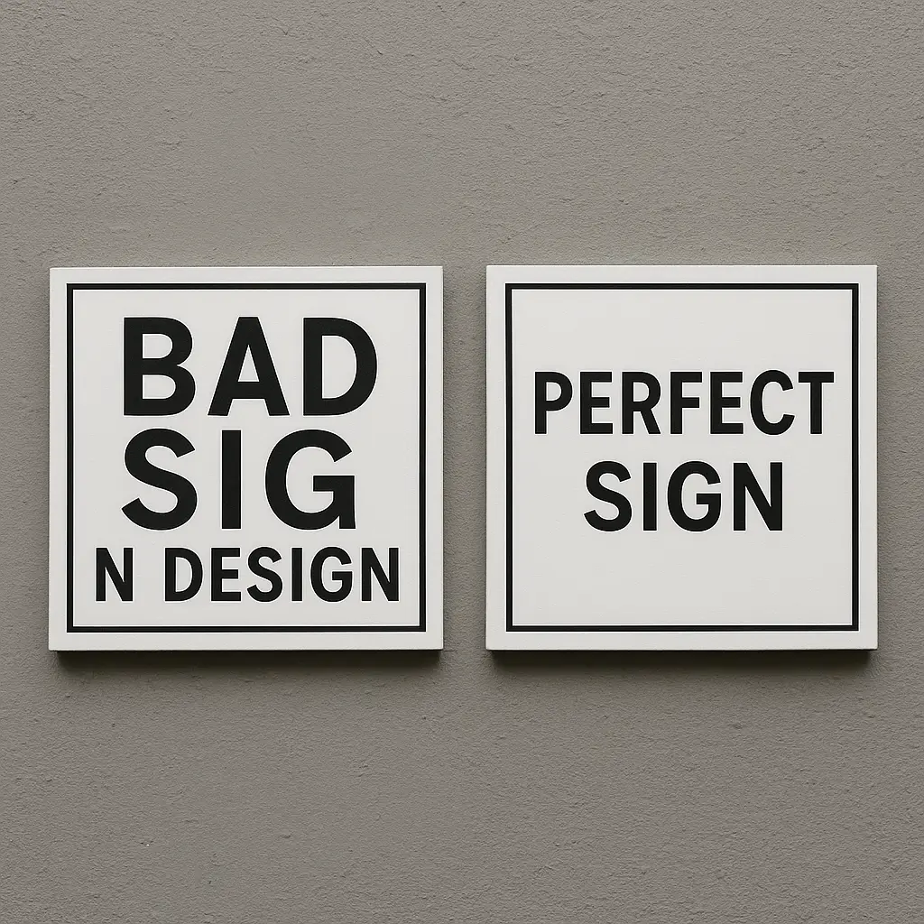
This is arguably one of the most fundamental and common sign errors. If customers can’t read your sign, it has failed at its most basic job. The main culprit is often font choice. While intricate script or highly stylized fonts might look artistic up close, they become an illegible blur from the intended viewing distance, especially for passing motorists. For effective sign design, clarity must always trump complex creativity. Stick to clean, bold, classic sans-serif fonts (like Helvetica or Arial) that are proven to be highly readable. Equally important is proper spacing. When letters are crammed too tightly together (poor kerning) or spaced too far apart, the brain struggles to process the words, defeating the purpose of a quick glance. Avoiding these primary signage design mistakes is the first step toward ensuring your message is actually received, which is the cornerstone of high signage legibility.
The solution is to choose function over flair. Opt for bold, universally readable sans-serif fonts and give your letters ample breathing room. The most critical step, however, is to simulate real-world conditions. Print a mockup of your design and view it from the actual distance a customer would—whether that’s across a busy street or from a passing vehicle. If you have to squint or struggle to read it within 3-5 seconds, it fails the test. This is one of the most practical business signage tips for guaranteeing high signage legibility.
Closely related to unreadable fonts, poor sign color contrast is another critical failure that severely impacts signage legibility. A trendy, low-contrast palette might look sophisticated on a designer’s high-resolution screen, but it becomes a washed-out, unreadable mess in the real world. Factors like bright sunlight, evening shadows, or glare from streetlights can make subtle color differences—like light grey text on a white background or dark green on black—virtually disappear. This is one of the most impactful signage design mistakes because it renders your investment invisible. For effective sign design, the foreground (text and graphics) must stand out sharply from the background. Proven, high-contrast combinations like black on yellow, white on blue, or black on white are timeless for a reason: they are processed instantly by the human eye from afar. Sacrificing this fundamental principle for a fleeting aesthetic trend is one of the most common sign errors that guarantees a poor return on investment.
The fix here is simple: go for maximum visual opposition. One of the best business signage tips is to stick to time-tested, high-contrast pairings: dark text on a light background or vice-versa. Before finalizing your design, use a free online color contrast checker to ensure your combination passes readability standards. If your brand guidelines use subtle colors, don’t sacrifice visibility. Instead, adapt by placing your logo or text on a solid, high-contrast block or by adding a strong outline to improve the sign color contrast.

A sign is a billboard, not a brochure, and treating it like one is among the most widespread signage design mistakes. The temptation to include every service, a phone number, a website, and social media handles is strong, but it creates visual chaos. A potential customer typically has only three to five seconds to see and process your message. When faced with a cluttered design, the brain is overwhelmed and simply disengages. This overload makes your sign impossible to read quickly, sabotaging your investment and making your business look unprofessional. Even with perfect fonts and high sign color contrast, a cluttered layout is one of the most common sign errors that will render your sign ineffective. True effective sign design champions simplicity, focusing on delivering one clear, concise message: who you are and what you offer. When it comes to signs, less is always more.
To fix this, practice ruthless editing. One of the most critical business signage tips is to distill your message down to its absolute essence. A great rule of thumb is to limit your sign to three key pieces of information: your business name, your logo, and a simple, three-to-five-word description of what you do (e.g., “Artisan Bakery” or “24-Hour Vet Clinic”). This hierarchy creates an instantly scannable message. Save the details like phone numbers and websites for your digital marketing, and let your sign do what it does best: attract attention.
Even a sign with perfect fonts and colors can fail spectacularly if it’s the wrong size for its environment. This is one of the most practical and yet frequently overlooked signage design mistakes. The crucial factor is the viewing distance. A sign that looks great on a design proof can become an unreadable speck when viewed from a fast-moving car 200 feet away. This is a common sign error that wastes marketing dollars, as the required letter height increases dramatically with distance. Proper sign placement and scale are inextricably linked; what works for a pedestrian sidewalk will be completely ineffective on a major highway. Conversely, a sign that is too large for its building can look unprofessional and overwhelm the architecture. For effective sign design, scale isn’t an afterthought—it’s a critical calculation based on your location and how customers will see you. Ignoring it guarantees your message will be missed.
To avoid this costly error, stop guessing and start calculating. A crucial guideline for effective sign design is the 10/100 rule: for every 100 feet of viewing distance, you need letters that are at least 10 inches high. You must also factor in the speed of the viewer; a highway sign requires much larger letters than a sidewalk A-frame. One of the most practical business signage tips is to physically visit your intended sign placement, measure the key viewing distances, and calculate your required letter height accordingly. This prevents one of the most avoidable signage design mistakes.

A perfectly designed sign becomes instantly ineffective if it is placed in the wrong spot. This is one of the most frustrating signage design mistakes because it can undermine every other good decision you’ve made. Bad sign placement can mean your message is physically obscured by a tree branch, another building, or even a frequently parked delivery truck. It might also be located outside the natural line of sight for your target audience—too high for pedestrians to notice or too low for drivers to see over traffic. Poor lighting can also render it invisible at dusk or create harsh glare during the day. This is a common sign error that wastes your entire investment and leads to missed opportunities. For effective sign design, the location is not a secondary detail; it’s a primary strategic decision that determines whether your message is ever seen at all.
The best way to ensure proper sign placement is to conduct a thorough site survey. Before you commit, visit the location at different times of day to assess how sunlight, shadows, and evening darkness affect visibility. Physically stand and drive by from all key customer approach angles. Look for any potential obstructions like trees, utility poles, or even common parking spots that could block the view. This hands-on analysis is one of the most crucial business signage tips to avoid one of the most frustrating common sign errors.
Your sign should be the most prominent physical representation of your brand, yet one of the most damaging signage design mistakes is a lack of brand consistency. This error occurs when a sign uses colors, fonts, or logo variations that don’t match your website, business cards, and other marketing materials. When a customer encounters a sign that looks disconnected from the brand they’ve seen elsewhere, it creates confusion and weakens brand recognition. This inconsistency can make your business appear disjointed, unprofessional, and less trustworthy. For effective sign design, your sign must be a seamless extension of your established identity, not a standalone piece of art. Ignoring this principle is one of the most common sign errors that can sabotage your marketing efforts, as it fails to build on the brand equity you’ve worked so hard to create.
The solution is to treat your brand style guide as non-negotiable. Before starting the design process, provide your sign company with your official brand guidelines, including specific color codes (Pantone, CMYK), approved fonts, and clear rules for logo usage. This simple act ensures perfect brand consistency across all customer touchpoints. This is one of the most crucial business signage tips for making your sign a powerful, reinforcing asset rather than a confusing, standalone piece that undermines your marketing.

After mastering legibility and branding, many businesses fall into one of the most subtle yet costly signage design mistakes: they forget to tell the customer what to do next. A sign that simply announces your name is passive. Effective sign design is active; it should guide, direct, and persuade. Your sign’s ultimate goal is to convert a passerby into a customer, and that requires a clear Call to Action (CTA). Whether it’s a simple “Open,” a directional “Enter Here,” or a promotional “Sale Today,” a CTA provides the crucial final nudge. Without it, your investment in great design and premium materials is undercut. Customers may see your sign, appreciate it, but then continue on their way because they weren’t explicitly invited in. This is one of the most common sign errors that directly translates to lost foot traffic and missed revenue, turning a powerful marketing tool into little more than a decorative plaque.
The fix is to be direct. Think about the single most important action you want a customer to take, and state it clearly. Your CTA should be short, command-oriented, and easy to understand in a split second. Use powerful words like “Enter,” “Open,” “Sale,” or directional cues like an arrow pointing to your entrance. This simple addition is one of the most impactful business signage tips because it transforms your sign from a passive announcement into an active invitation, which is the cornerstone of effective sign design.
Choosing the cheapest option is a tempting but shortsighted strategy that ranks high among critical signage design mistakes. A sign is an investment in your brand’s physical presence, and skimping on sign materials is a false economy. Low-quality materials like thin vinyl, untreated wood, or flimsy plastic will quickly fade, crack, peel, and warp when exposed to the elements. A weathered, dilapidated sign sends a powerful negative message to customers: that your business is temporary, cheap, or doesn’t care about quality. This is a common sign error that directly damages brand perception. Furthermore, the material must be appropriate for your brand’s identity—a high-end law firm using a corrugated plastic sign looks jarringly unprofessional. Investing in durable, suitable materials like aluminum, acrylic, or high-density urethane ensures your sign withstands the test of time and continues to represent your business professionally, which is fundamental to effective sign design.
To avoid this mistake, consult with a reputable sign professional about your options. They can recommend the best sign materials for your specific climate, whether that requires weather-resistant aluminum, UV-stable acrylic, or professionally treated wood. Always align the material with your brand identity—brushed metal for sophistication, rustic wood for a cozy cafe. One of the smartest business signage tips is to view your sign as a long-term asset, not a short-term expense, ensuring it represents your quality for years to come.
Perhaps one of the most costly and frustrating signage design mistakes has nothing to do with design and everything to do with due diligence. Eager business owners often design and commission a beautiful sign, only to discover it violates local ordinances. Nearly every city and county has specific regulations governing sign size, height, lighting, materials, and sign placement, especially in historic districts or planned commercial zones. Ignoring these rules is a high-stakes gamble. The consequences can be severe, ranging from hefty fines to a legal order to remove the non-compliant sign entirely, wasting your entire investment. This is a surprisingly common sign error that can halt your business’s opening and sour your relationship with local authorities. Truly effective sign design is not just visually appealing but also legally permissible, making regulatory research a non-negotiable first step in the process.
Make this your first step, even before finalizing a design. Contact your local municipal planning, building, or zoning department and ask for a copy of the sign ordinance. This document will detail all restrictions on size, lighting, materials, and sign placement. Partnering with an experienced, local sign company is also one of the best business signage tips, as they are often familiar with these regulations and can manage the permit application process for you. Securing permits early prevents one of the most financially devastating common sign errors.
It’s the final and most preventable blunder, yet it remains one of the most embarrassing signage design mistakes. After investing time and money into materials, placement, and branding, a simple typo or grammatical error can instantly torpedo your credibility. A misspelled word or incorrect phone number screams carelessness and a lack of professionalism. This isn’t just a minor cosmetic issue; it’s a common sign error that actively undermines customer trust. A potential client might think, “If they can’t pay attention to the details on their own sign, how can I trust them with my business?” This single oversight can overshadow every other aspect of effective sign design, turning your expensive marketing asset into a public display of inattention. The damage to your brand’s reputation can be far more costly than the sign itself, making meticulous proofreading a non-negotiable final step.
Never be your own final editor. Your brain knows what the sign should say and will often auto-correct errors. To avoid this costly mistake, create a formal sign-off process. Have at least two other people meticulously review the final proof for spelling, grammar, and factual accuracy. One of the most effective business signage tips is to read the text aloud and even backwards to catch errors. Double-check every digit of a phone number and every letter of a web address. This simple QA step prevents the most damaging common sign errors.
Your business signage is a powerful investment in your brand’s reputation and visibility, not an area for shortcuts. As we’ve seen, the difference between a sign that attracts customers and one that repels them often comes down to avoiding a few critical blunders. The most impactful signage design mistakes are not just aesthetic; they are strategic failures that undermine your marketing budget. By prioritizing clarity, contrast, and simplicity, you can conquer the most common sign errors related to legibility. By carefully planning for size, placement, and materials, you ensure your sign functions effectively in its physical environment. Finally, by adhering to brand consistency and local laws, you build a professional and trustworthy presence. Use these business signage tips as a comprehensive checklist to guide your process, ensuring your final product delivers an outstanding return on investment and serves as your hardest-working brand ambassador.
Compare Adobe Firefly vs Canva Magic Studio. Discover which AI design tool is best for professionals seeking precision or marketers needing speed for their creative projects.

Explore how AI is transforming SEO, from powering search engines to enhancing content creation and user experience. Learn practical strategies to thrive in the AI era of search.

Master prompt engineering for beginners! Learn essential techniques to craft effective AI prompts and dramatically boost your Large Language Model (LLM) results.